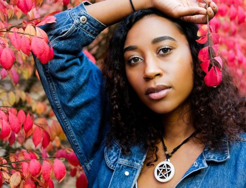
Making images that stand out amongst all the great work circulating online is no easy task, but since adding Exposure to my workflow my images have more of an edge. In particular, they have a clarity and punch that they didn’t have before. In the article below, I share a few Exposure tips I use to make my portraits pop.
Enhancing Presence
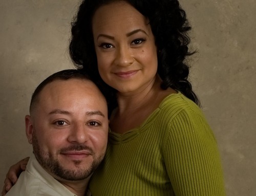
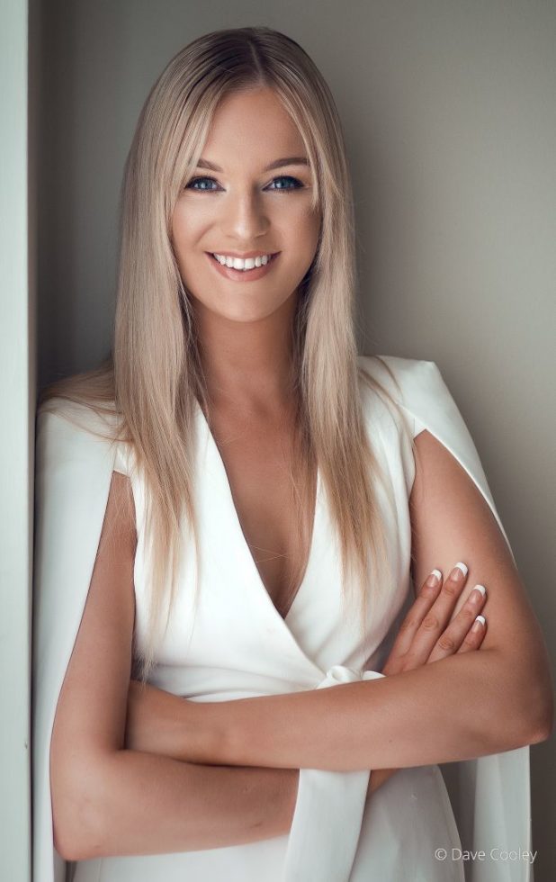
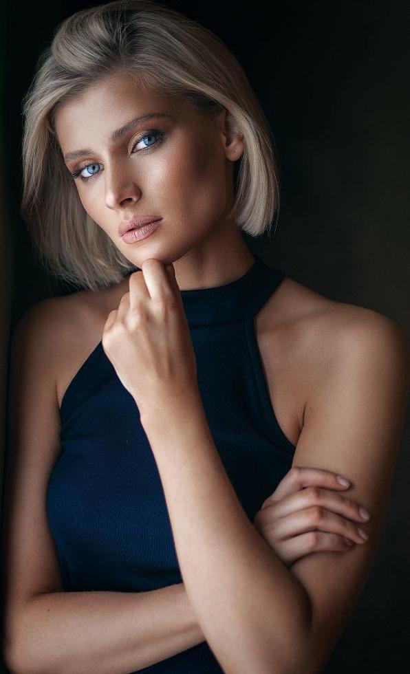
As a portrait photographer I used to face the dread of fine-tuning clarity or contrast in Lightroom to give more presence to a shot. These adjustments caused unwanted texture in the tones of skin. So, I would have to retouch the photo a second time to remove those effects. Exposure lets me give my photos the same kind of pop, but much higher quality. The adjustments are so smooth and clean that I don’t have to backtrack and retouch the skin a second time. That adds up to a huge time savings. In the example shots in this article you can easily see the softness, or haze in a few of my photos, and how well Exposure executes adjustments in the midtones.
Balancing Clarity and Contrast
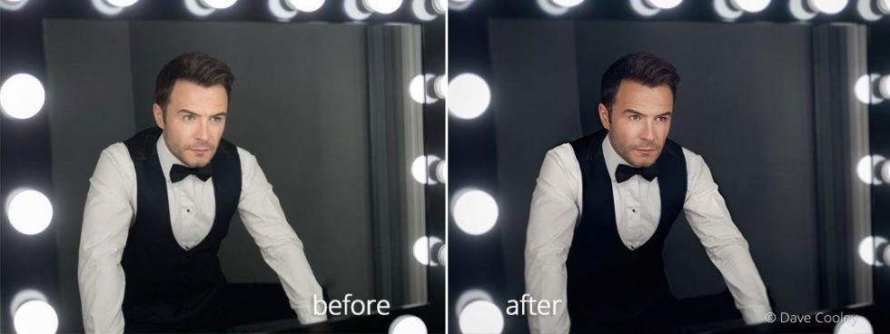
When making adjustments to add pop, I start with clarity. This increases local contrast, and adds separation between the tones. I follow this with adjustments to contrast, which gives more presence to the subject by emphasizing the difference in luminance (light to dark value). I’ll switch between these two controls making adjustments to balance the look for each photo. One of the great things about Exposure is how far you can push your images without damaging them, so this process is reasonably quick.
Presets for Portraits with Punch
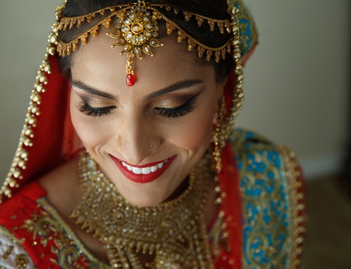
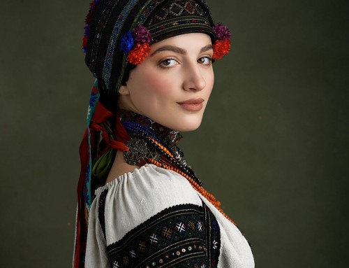
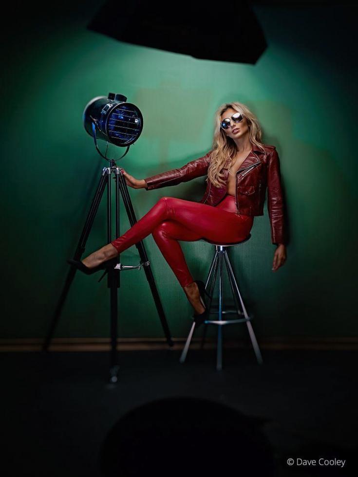
Some of my go-to Exposure presets are the Technicolor Process 4-strip varieties. They add a pleasing tone to the skin, and they remove unwanted green or yellow hues. After I apply one of the Technicolor 4 presets and adjust the effect opacity to work with the photo, I then make balanced adjustments to clarity and contrast to make the subject pop. Making these adjustments in Exposure will keep skin looking real and with a natural texture.
Fine Color Control
Another batch of the Exposure features I absolutely love are the saturation controls for image highlights, midtones, and shadows. As with all the sliders in this panel of Exposure, these are precise controls with little to no overlap. This accuracy enables me to micro-adjust skin color, smoothly. Also in the color panel are the extremely useful color luminance controls. One of the often overlooked uses for these sliders is creating color-specific dodge and burn effects, which can be used to make eyes pop, add a bit of color to the background, brighten the complexion, and more, and you still have a full range of controls and non-destructive layers to customize the effects for each photo.
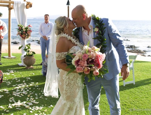
Gentle Overlays
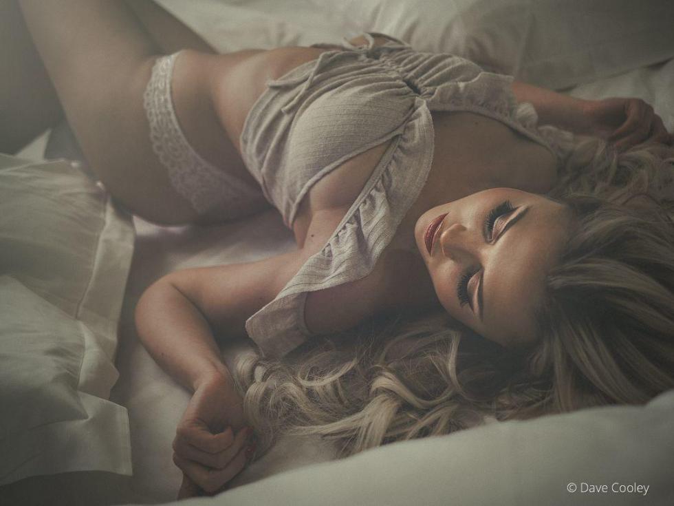
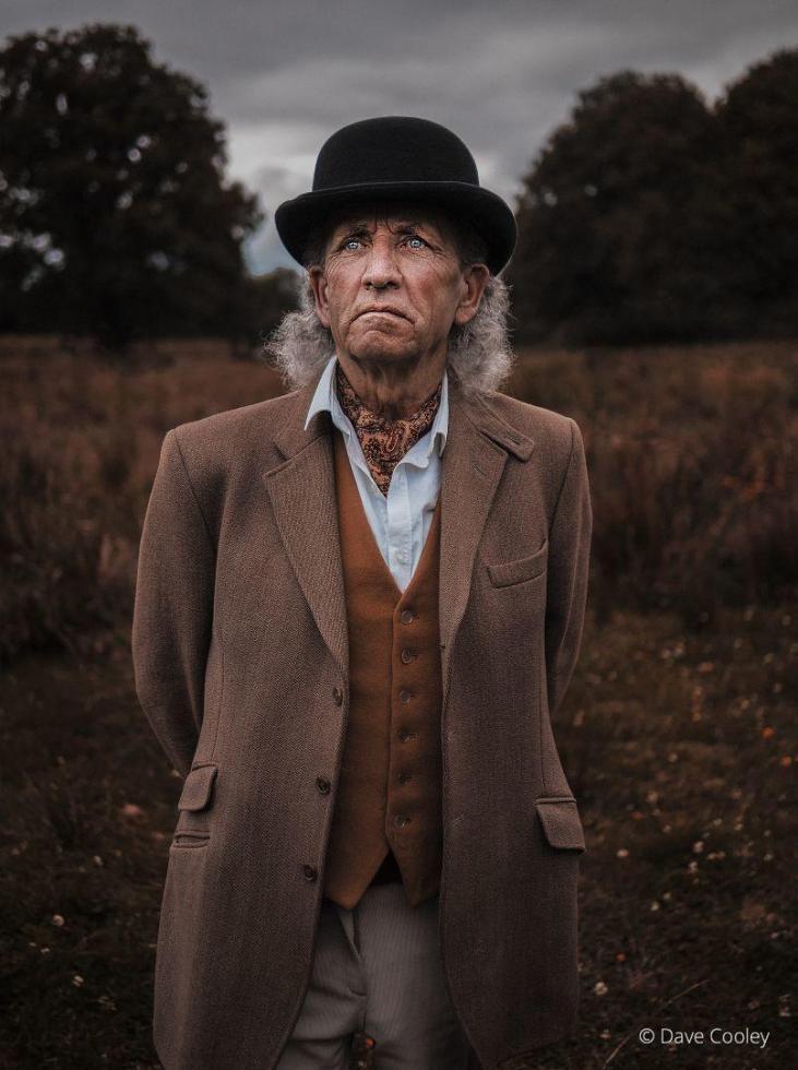
When placing overlays in portraits, I want them to set ‘in’ the shot rather than over the top. The effects of the latter can quickly appear awkward, which can distract the viewer’s eye from the subject. This example shows how subtle warming can add to a scene and help focus the attention on the subject.
Conclusion
The robust editing controls in Exposure make my photo editing life easy and I love the way it makes my images look. It’s one of my go-to tools for all my portrait work. The superior clarity, contrast, broad selection of great-looking presets, and enhanced color luminance controls in Exposure are excellent options for giving your portraits the pop you’ve been looking for.
Try Exposure Today