
Ryan Longnecker is a travel and documentary photographer based out of Los Angeles, CA. He has a good eye for taking gorgeous, inspiring photos of the outdoors. We recently connected with Ryan about his editing workflow. He specifically noted that Exposure provides him with beautifully unique controls for adding grain to his images. Ryan has always been a digital shooter but still finds that using Exposure’s film grain effects give him additional creative options when processing photos. In the article below, he talks about his approach for adding grain to his photos.
So, I’ll start off by saying I have no expertise in replicating film grain, or much of a scientific explanation to much of my post processing (maybe with the exception of color theory). Simply put, the grain in Alien Skin’s Exposure does not degrade the image, even when applied necessarily heavy. I say necessarily because there needs to be an element of understanding of typical situations that would produce a grainy image. Knowing that will help you in your own processing.
Where did grain effects come from?
Grain shows up when we push our camera’s ISO up to capture a dark image. That higher ISO increases the light sensitivity of the sensor, but it comes with a trade off. The pixels look less creamy and more ‘grainy’ at higher levels, so the images are more clear when the ISO is lower. If you want to add a lot of grain to your image then it will look the most natural on images that have lower light. Whether you actually took your shot at blue or golden hour, or in the shade and your edit is darker and moodier, putting a bit more grain on the image is going to look the most natural because that’s what we’ve seen for years of actual film photography. In contrast to that, shots taken in heavy sunlight typically don’t have as much grain because of a lower ISO for the shot. When processing those, less grain will produce a bit more natural-looking effect.
What about those of us who like grain, but aren’t trying to replicate film?
I put myself in this category. There’s a lot of stock placed in making something look exactly like a beloved film that was popular for years, and for good reason. Some of those films produced incredibly pleasing shadow and highlight tones. Images taken with them evoke a sense of nostalgia or emotion or maybe they are just good for color theory nerds. However, some of us go purely based on the aesthetic of what we see onscreen and in print. In that case, I’d argue that the rules are much more subjective to each artist. Even still, Exposure’s grain engine gives you some amazing options to control grain strength, amount, type, size, etc… you can even achieve a pushed film look if you’re looking to replicate a favorite analog effect.
By “pushed” I mean shooting with a film with a lower ISO rate and compensating the exposure during film processing. The exposure is brought up, or ‘pushed’ beyond the manufacturer’s developing recommendations, which creates a uniquely sharp grain effect. A good friend of mine, Ben Sasso, has a technique with digital that replicates it by underexposing his digital pictures a LOT and pushing them back up in post production to create a unique and natural grain.
When I add grain, it is solely through Exposure. One of the main reasons I add grain is because I want the image when viewed onscreen to have that touchable, tactile, textured quality. I think about it like it’s a sheet of fine-grit sandpaper. I want the completed work to evoke the idea of a printed picture when you view it. So I usually make the grain small, add it most in the shadows and least in the highlights but still across the whole image.
For those of you who are still struggling to find your consistent voice in your editing style, practicing your grain, finding something that speaks to your style, and applying it to an entire session might add that extra level of fluidity across the entire set. I’d suggest looking at it and learning how to use the grain panel, and how it corresponds with Bokeh’s grain matching options in Exposure. Whether you shoot fine art, weddings, portraiture, landscape, lifestyle, or fashion, you’ll want to find a style that is truly your own, something that catches the eye and is not a one-click preset option for someone else to copy. Give yourself the patience to draw from your inspiration and make it truly your own.
Adding Grain in Exposure
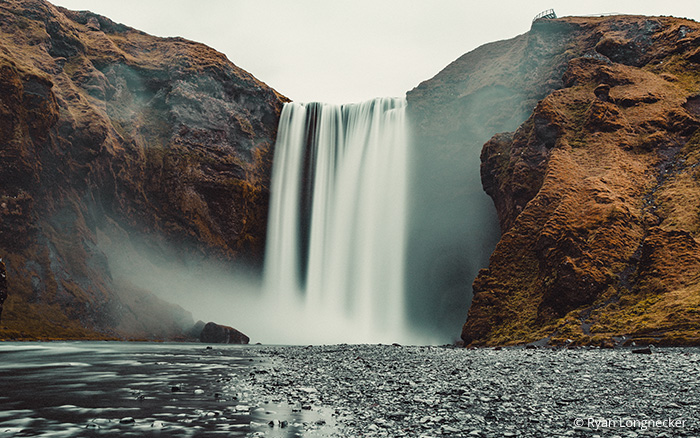
Image 1: Skogafoss, Iceland.
Here are practical-use tips to go along with example images. I’ve included some images shot on my Canon DSLR with enough light for low ISO 50-160, so there’s no inherent digital grain in the images to start with. I’ll share how I approach adding grain in Exposure.
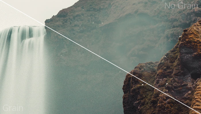
The grain controls in Exposure enable you to configure different grain behavior, such as the amount of grain visible in the highlights, midtones, and shadow areas.
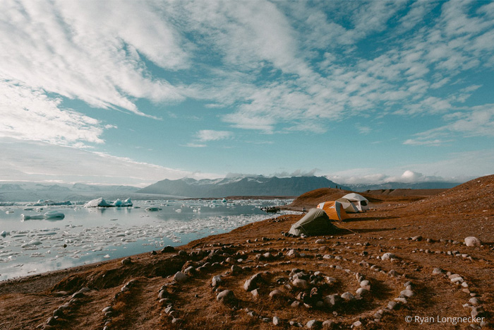
Any time there is water mist, sand being kicked up, fog, water spray, or any other sort of fine detail in the nature, I think grain is an easy fit across the board. Adding grain even into the highlights which can look unnatural in other situations can look fine in these. It can add to the misty/grainy atmosphere of the image and can also add a tactile quality to an otherwise glossy image. I prefer matte finish on almost everything and I find a fair amount of fine grain (hence the 4×5 size and relative size) works really well.
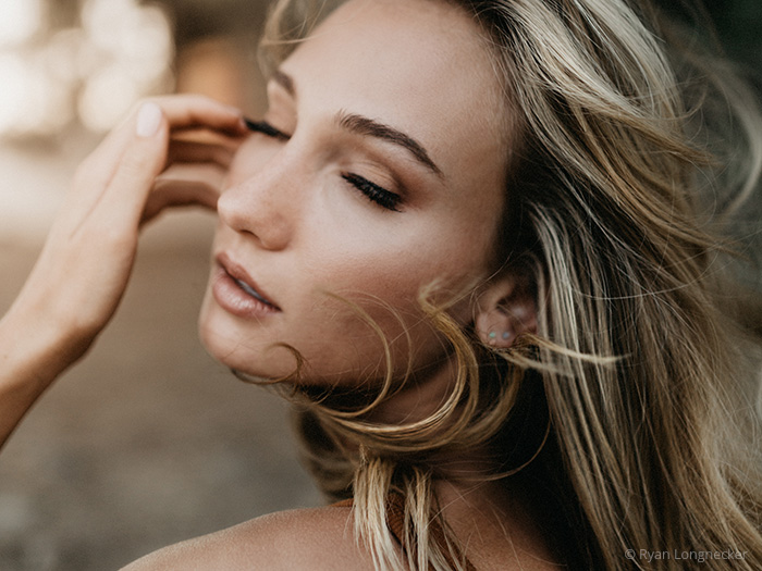
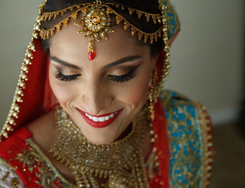
Image 2: Portrait
I don’t do as much portraiture anymore but if you want to add grain into portraiture a tip would be to bring the amount in the midtones down so that it is not overly dominant in the skin of the image. I leave the roughness and relative a bit more coarse and bump the grain up in these images mainly on shadows. I also make sure there is no color variation that would impact the skin tone in any negative way.
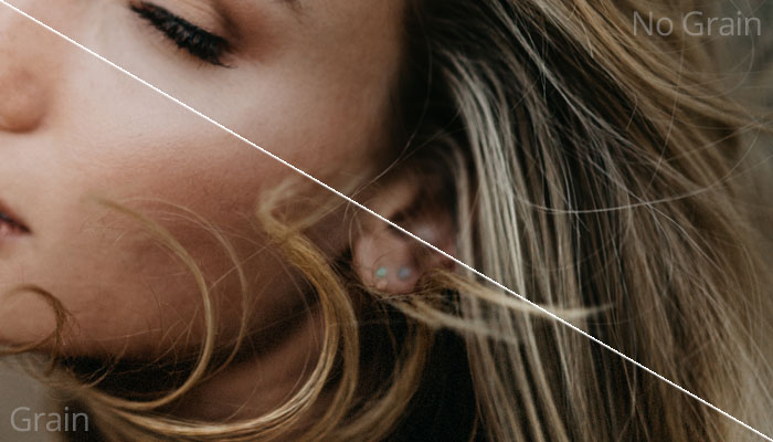
In Exposure, you can decrease the grain amount in the midtones to reduce its appearance on skin tones.
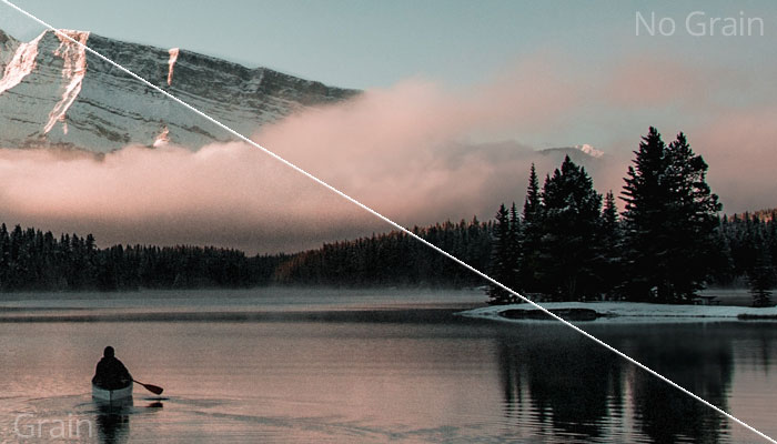
For the last 2 images of the boat on Banff, these were shots taken in light that could have very well pushed ISO up and had inherent digital grain on the images so I don’t have any problems adding grain into each section of luminance of the image. For similar reasons as before, I enjoy the grain feel of an image rather than the technicality of where it should land so if the image does not have overly pronounced highlights or shadows then it feels much more appropriate to add grain across the entire image. For nature shots where there aren’t pronounced details or mist, I feel keeping the grain a bit more on the rougher side is totally fine. If you notice the sky also takes on a different blended feel once the grain is added and in print this will translate much better than just viewing on a phone via social media.
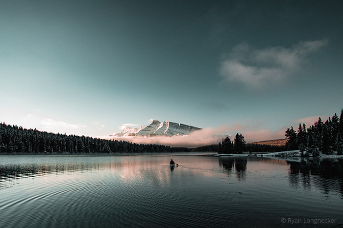
Image 3: Banff Boat
Rougher grain works on landscape shots without mist. The sky takes on a different feel when coarse-looking grain is added.
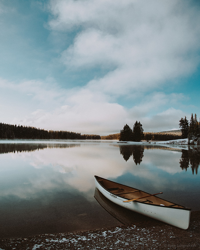
Image 4: Baniff Boat
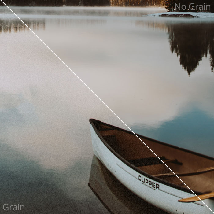
Exposure’s grain really comes alive on printed photos. Stronger grain effects work well when the image doesn’t have pronounced highlights or shadows.
–
Thanks for sharing your grain approach with us, Ryan. It’s good to hear about adding grain effects to photos for aesthetic reasons rather than solely for film emulation.
Learn more about Ryan on his website or follow him on Facebook, Instagram, or Twitter.
Try Exposure Today

Nice article and beautiful photos! :)
I really think grain adds life to digital photos!
Wow amazing! Makes a big difference for sure. I am looking forward to purchase your software soon.