
Easily go from photo to painting with Snap Art
Software enables us to do some very cool things, but the trick is to know when to use them…and not overdo them. Case in point: some of you can remember when software first enabled HDR (high dynamic range) photography. Suddenly every other photo you saw on photo sharing sites was a grossly overdone tonemapped image that drove the purists crazy. It is rare to see such an image today, even though many of us use a similar technique to combine multiple exposures in a natural way. The technology was cool, but using it properly requires a more delicate touch than what many early adopters exhibited.
Snap Art 4 is a very cool piece of software. It enables you to change from photo to painting in a few simple steps. But I don’t throw every photo I take into Snap Art for the simple reason that I’ve learned that not every photo works in Snap Art, any more than using HDR on everything did.
To paint or not to paint…that is the question.
Butchering Shakespeare aside, our point here is to take a look at what kind of image works well in Snap Art.
As a quick aside, let me quickly say that I recognize that everyone has different tastes in art. I’m not trying to suggest that the approach I will describe is the only way (or even the best way), but the concept that I am sharing applies to many different styles and tastes.
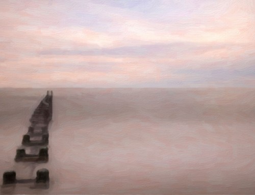
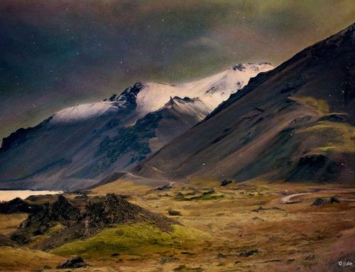
Long before I began using Snap Art, I noticed some photos had a “painterly feel” to them. It might be the color palette that strayed beyond the norm into the vivid or the pastel. It might be the nature of the scene that triggered subconscious memories of famous artworks. Or, as in the case of this photo, it might be that nature seemed to have already been doing some painting.
© 2016 Thousand Word Images by Dustin Abbott
When a photo to painting transformation works and when it doesn’t
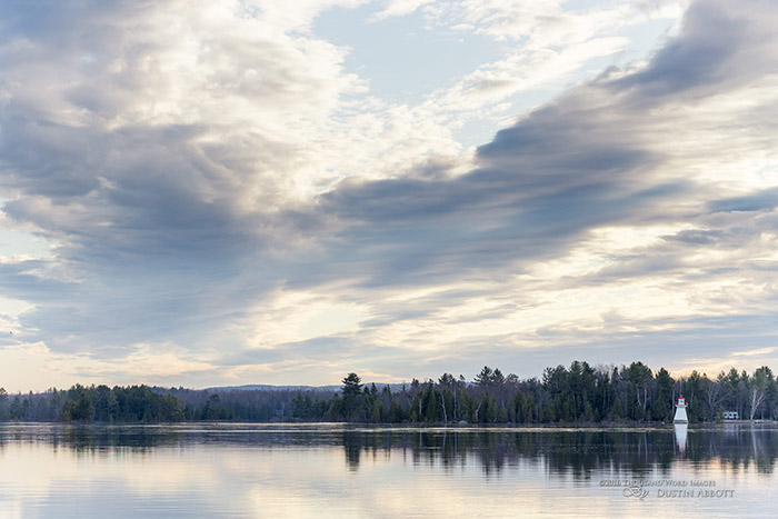
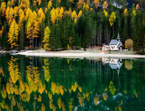
I got up early to go out and shoot landscapes. A storm front was slowly moving into our region, and the day itself dissolved into cold, torrential rain. The morning was beautiful, though, with complete stillness across the massive Ottawa River that divides Ontario and Quebec . There were wonderfully expressive clouds above. The sun quickly hid, but I was left with nicely lit, beautifully flowing clouds that looked as if the sky were brushed in by the hand of God.
I took two exposures. One for the sky, so that the highlights would not be blown out. The second was for the distant shoreline, so that I would not lose the shadow detail there. I combined these through a far less extreme process from early HDR that left me with a nice, natural looking image.
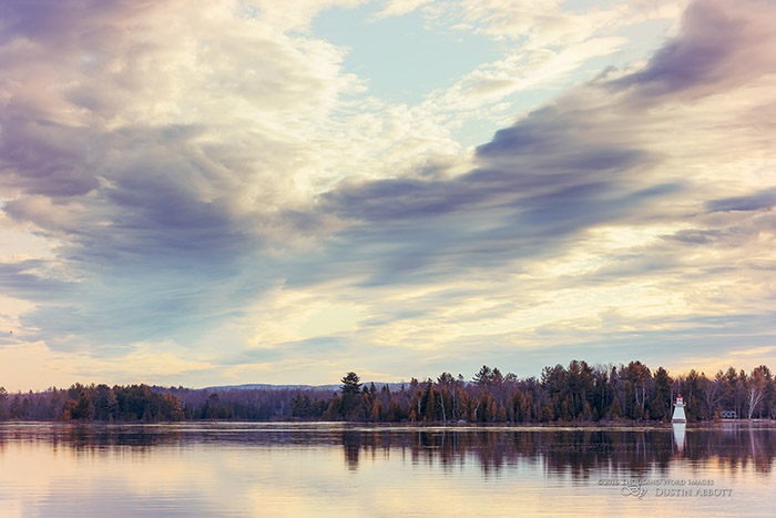
Clearly this was a lovely photo just as it was, but I wanted to add more drama with a few coloring tweaks. I took the image into Exposure to see what I could do.
I had been working on some monochrome shots, so I happened to have a panel of monochrome oriented presets opened. A custom look based on the FSA Red Bleach preset that I had developed caught my eye. I tweaked it to a fairly low intensity (52%) and added some warming and sharpness. The end result was an image that really added extra flavor to the sky and gave the shoreline more of an autumnal feel. I really liked the result.
© 2016 Thousand Word Images by Dustin Abbott
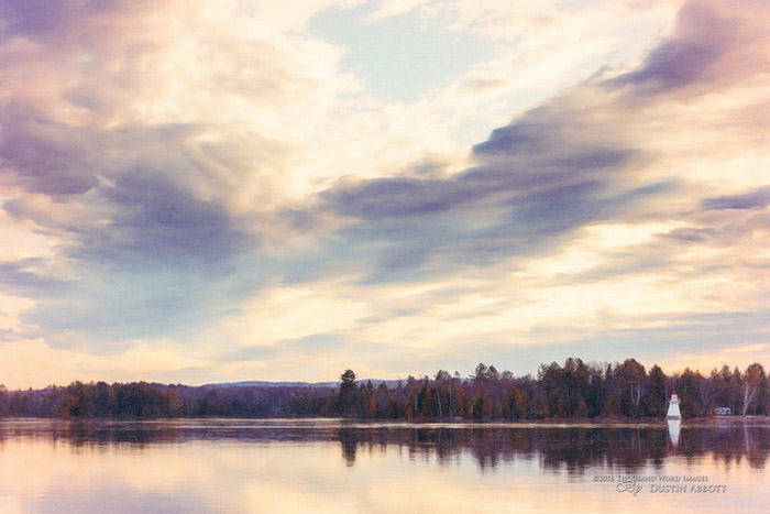
It was right then that I saw Snap Art written all over this photo. The fabulous “brushstrokes” in the sky were already very painterly, and I now had a fabulous color palette that looked more “art” than photograph. I immediately took the image into Snap Art.
One of the things that I love most about Snap Art is the ability to easily control the nature of the brushstrokes. Often, I want to add the effect of longer brush strokes to create a more painterly look, but in this case the image already had naturally long, flowing movement in the clouds. Overdoing the brushstrokes in this photo would actually detract from the sky instead of adding to it. It needed a subtle touch, and fortunately the customizable nature of the software allows for that.
I started with an oil paint preset but adjusted the stroke length down. The color variation control remained high in order to add some painterly complexity to the color. I wasn’t happy with the loss of detail in the far shoreline, though, as I felt that component was a strength of the image. To combat that, I turned the photorealism slider way up. It gave a look like that of highly detailed landscape painters.
© 2016 Thousand Word Images by Dustin Abbott
Thanks to the texture of Snap Art, I now had what looks like a detailed oil painting on canvas. What made this work look so nice was an instinct honed through use of what works in Snap Art…and what doesn’t. The end result doesn’t feel forced or contrived, but is what I would call a natural use of this amazing software. Not everything is going to work in Snap Art, but learning when “to paint or not to paint” is part of what being an artist means in the digital age.
Try Exposure Today

Hi Dustin. Happy to read your post. I am also looking what are the rules I can simply use to pick the most painterly photos. No lightroom automatic filter available…I need to use my sense of art.
Your explanation was well done and easy to follow. I have been a professional photographer for
more than 25 years and understand the power of digital and how to keep it under control.- Your story
was well taken. Thank you.
John
Thank you for sharing your thoughts.