
Tim Grey taught a great lesson on using Exposure X2’s creative effects in his webinar titled: Effects for Creative Vision.
He covered topics such as how to anticipate which creative effects might work well, how to achieve a sense of drama versus subtlety in a photo, how a vignette effect impacts an image, and the importance of color, or the lack of color. If you are interested in using Exposure’s creative tools effectively, this video is perfect for you.
Transcript
My focus today is really thinking more about creative interpretations for a photo. I think this is a little bit of a – you might say – unique presentation in that my focus is not really exactly on teaching you the process as it were for applying those effects, but rather to give you some food for thought to encourage you to think about how you might approach your images, kind of a mindset essentially for how you think about your photos and therefore what sorts of adjustments might make the most sense. Now for today’s presentation, I happen to be using Alien Skin Exposure X2, which is a new update to Exposure from Alien Skin. This product started out – interestingly enough, and part of what drew me to it, what got my interest in it in the first place – the earlier versions were really focused on applying a variety of film effects. And I got my start in photography with a high school photography class working with black and white film in the wet darkroom with those wonderful chemicals, and so I have a sort of natural affinity. Maybe a bias admittedly, toward some of these kind of older processes, black and white interpretations, those retro film looks. So as you will see shortly, there are a variety of preset effects that are available within Exposure and a lot more. As you’re probably familiar with a variety of different software tools, I certainly encourage you to take a look at Exposure. There’s a free trial available through the Alien Skin software website.
But the presets as is often the case with software for optimizing and interpreting your photos, all of the presets that are available – so we can see a list of presets over on the left hand side of the frame here – those presets relate to specific settings over on the right side. So any preset that is available, I could have achieved that same look just by going over on the right side of the interface here and choosing all those various settings. I think there’s a tendency for photographers to think, “Oh, preset? No. I don’t want to give every single image the exact same look.” What I found, especially with software like Exposure where we have a wide variety of different creative presets to choose from, that actually can serve as a really nice way of getting some creative inspiration. So Alien Skin Exposure can give you some creative inspiration, and hopefully today I can give you some of that as well.
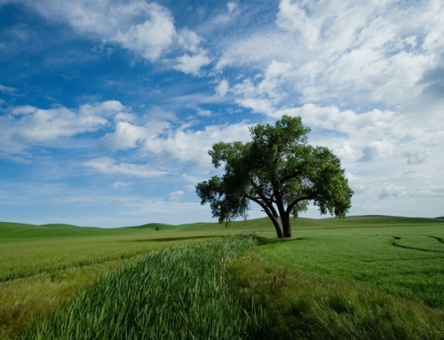
Let’s go ahead and dive right into my first image here. I want to talk about this distinction of subtlety versus drama in an image. It’s one of the first things that I personally tend to think about with a photo. That is essentially whenever I capture an image, it’s because something caught my eye, a scene looked interesting to me, whatever it was. It could be just the play of light, it could be the color. It could be the texture. It could be the subtlety of the scene or it could be the drama, the way the scene just jumps out and grabs you. When we’re working with our images after the capture, then we have the ability to further interpret. So if it was a dramatic scene, we can make it look even more dramatic. If it was a more subtle scene, we could make it look even more subtle. And so I think it’s important to think about your motivation for capturing a photo in the first place, what was it about that scene that made you push the button on the camera to take a picture, and what is sort of the mood of that scene? And in fairness, keep in mind that there is often more than one way of interpreting a photo, there’s often more than one way that you might feel about a photo, that you might react to a photo, and so there’s not always just a single right answer. And I’d encourage you as a photographer to explore all of the possible right answers for an image, to figure out what might make the most sense for you. So with a scene like this, certainly there is an appropriate way to interpret this in a very subtle interpretation, but I could also take it in a more dramatic direction.
So when it comes to that subtlety versus drama, what sorts of adjustments might you want to think about? Well, there are few key things that I would say when it comes to drama versus subtlety in a photo. One would be the overall contrast. So are our shadows deep and dark, and are highlights very, very, bright? And then do we want to enhance that or take in any other direction, tone it down a little bit? So more contrast generally gives us more drama. So if I just apply a very simple boost in contrast, you can see that this image starts to become more impactful. I could also take that a step further, kind of finesse the image a little bit by maybe darkening down or brightening up just the highlights. If things are looking a little bit too strong, I could open up a little bit of shadow detail to help offset that, but contrast in general. And so similarly, if I want to tone down that sense of drama – if I want to make the image a little bit more subtle – I can reduce the contrast. I can maybe darken down those highlights a little bit. I can open up those shadows. Now I do need to be careful if I’m trying to make an image look a little bit more subtle. I, generally speaking, don’t want a washed-out look. I don’t want those shadows to start looking muddy, so I do need to be a little bit careful. But again, one of those key attributes that relates to the overall sense of drama versus subtlety is contrast.
Another would be overall color intensity or saturation. So if I really want an image to jump out and grab the viewer a little bit, I want a big strong impact, then I might want to boost the strength – the intensity – of the colors to make those colors more pure. So, for example, increasing vibrance and/or saturation. Obviously in this case, I’ve pushed a little to an extreme. But just to give a sense that the stronger the colors, the more intense the colors, the more drama we’re going to have in the photo. And then in many cases, reducing saturation. I do think many photographers have a tendency to just think, “Saturation? It needs more.” Sometimes we get carried away maybe. But very often I find that reducing saturation, it’s not as common an adjustment. It seems to me that many photographers don’t really think about that.
And then one of the other elements as it relates to the drama versus subtlety of a photo, would be the accentuation of detail. For example, in the context of Exposure – and we see a similar adjustment in other tools as well – a clarity adjustment, enhancing the texture and detail, as an option, reducing saturation, but it can be very, very impactful. In some ways when you reduce the impact – the intensity, the drama of a photo – it actually almost makes that photo a little more impactful.
Maybe darken down those highlights a little bit. I can open up those shadows. Now I do need to be careful if I’m trying to make an image look a little bit more subtle. I, generally speaking, don’t want a washed-out look. I don’t want those shadows to start looking muddy, so I do need to be a little bit careful. But again, one of those key attributes that relates to the overall sense of drama versus subtlety is contrast.
Another would be overall color intensity or saturation. So if I really want an image to jump out and grab the viewer a little bit, I want a big strong impact, then I might want to boost the strength – the intensity – of the colors to make those colors more pure. So, for example, increasing vibrance and/or saturation. Obviously in this case, I’ve pushed a little to an extreme. But just to give a sense that the stronger the colors, the more intense the colors, the more drama we’re going to have in the photo. And then in many cases, reducing saturation.
I do think many photographers have a tendency to just think, “Saturation? It needs more.” Sometimes we get carried away maybe. But very often I find that reducing saturation, it’s not as common an adjustment. It seems to me that many photographers don’t really think about that as an option, reducing saturation, but it can be very, very impactful. In some ways when you reduce the impact – the intensity, the drama of a photo – it actually almost makes that photo a little more impactful.
And then one of the other elements as it relates to the drama versus subtly of a photo, would be the accentuation of detail. For example, in the context of Exposure – and we see a similar adjustment in other tools as well – a clarity adjustment, enhancing the texture and detail, essentially making every little nook and cranny really stand out. In many respects, you can think of this as being similar in concept to sharpening. It’s just sharpening with a little more of a creative flair, as opposed to literally trying to optimize focus in the image. But then also, on the subtle side of things, we can reduce clarity. We can soften up the texture and the details. This works wonderfully well for the more ethereal types of scenes for photographs of flowers, for example, delicate subjects for photographs of people. They can work out very, very nicely to add a sense of subtlety, it makes the scene a little more approachable, a little warmer, a little more inviting. So that can be very interesting as well.
So I encourage you to think about those several attributes. I think most photographers have kind of a tendency…For me personally, I have a tendency to air on the side of a little bit more drama as opposed to a little bit more in the way of subtlety but– so that’s my personal taste. But it also varies a lot, depending on the image. So you probably have your own bias, one direction or the other. But then you also want to think about the image itself, your motivation for capturing the image in the first place, and figuring out what makes the most sense for that image based on that interpretation.
I want to also point out, I’ve sort of played around with these sliders, one of the features that I like within Exposure here is that we can apply an adjustment that’s too strong and then just reduce the overall intensity of that adjustment. So I’ll just apply a big boost in contrast, and a boost in vibrance for the overall saturation and the clarity. So here is a much more dramatic interpretation of the image. In theory, those adjustments might be good adjustments, meaning that I wanted to enhance drama in the photo. And I certainly have done that, but I got a little heavy handed with all of my adjustments and so the overall effect is too strong. I can just come up to the overall intensity slider here and start to back that down, and it essentially is just toning down my overall adjustment for the image. So that’s a nice feature that can be very helpful. Especially when we’re talking about creative adjustments, I think it’s a very good idea to experiment, to explore different options, different possibilities. Sometimes that means the result is a little too strong, and here’s a slider that makes it easy to just tone that down a little bit.
I also find that color can be a big impact. This is a scene – well, I’m sure everyone knows, at least – that this is Seattle. Maybe you know exactly where this is photographed from, a common spot in Seattle, Kerry Park, for photographing the skyline. And I captured this at blue hour, just a little bit after sunset. A little bit of color in the sky, so we’ve got a little bit of that glow on Mount Rainier. The blue was really what drew me to this scene, and so I tried to interpret it initially in a very sort of clean way.
But one thing that I found can be very, very helpful for a variety of images, is instead of trying to chase the balance of colors in a photo, to simply add a color filter effect. Essentially like a color overlay. If this were a photographic print, the analogy might be that we had a clear sheet of acetate that had a little bit of a color tint that I laid down on top of the print. And here for example within Exposure, we have this color section. I can choose a variety of different presets, for example. So here’s a warming filter, and you can see that that’s giving me a much more kind of golden look. You see the yellows that are reflecting off of the Space Needle now. And then I can fine tune the overall strength, so I can shift the color. In this case, I chose a preset, a warming filter. So we have this shade of orange. I certainly could change that if I wanted to, I could fine-tune the balance between warmth and cooling of the image that is a little bit more yellow versus a little more blue essentially.
But more importantly I think, is that I have once again that strength control. So in this case, a density control so that I can choose how strong a color balance shift I want to apply. So I’m essentially applying what is equivalent to a color balance adjustment or a temperature and tint adjustment, but I’m doing it by just saying I want the image warmer or I want the image cooler, I want to take it in a particular direction. That can often make things a little bit easier. And then of course, I can adjust the density, the strength of the setting in this case. So here we retain a lot of those blues, for example, but now I’ve got this sort of glow effect – a little residual color from sunset essentially – being added to the scene. So I could continue fine tuning that, but very often I find just adding a simple color can really help the overall appearance of a photo.
It’s interesting also, I talk on a somewhat regular basis about a vignette effect. And I think about vignettes a lot, I often do find that I like to add a vignette effect to some of my photographic images. I’ll give you another example in just a moment, but first I want to talk about what is essentially the opposite. And I find that many photographers almost ignore the fact that it is possible to have a vignette effect that is lightening the edges, rather than darkening the edges. And so usually when I think vignette – I think this is maybe true for many photographers – when I think about a vignette effect, I’m automatically thinking about darkening up the edges. And in many cases, the motivation for that is actually to kind of enclose the photo, to frame up the photo, so that the eyes of the viewer don’t kind of drift off outside. So it helps to kind of encapsulate that overall image, so that we end up with framing up. I’ll talk about another example of that in a moment.
But in some cases when I have a brighter image and especially bright edges, I actually like to create a little bit of a sense of just kind of fading off into oblivion for the image. And so for that, I actually like to apply a lightening vignette. So a typical vignette would be darkening the edges, I very often like to add a lightening effect to brighten up those edges of the image. I can then of course, once I’ve set a strength – I’m brightening in this case – so a negative value here for my vignette, then I can also adjust the size. So how close to the center of the image does it get, for example, how round versus more of a rectangular shape is it, how much of a transition, a soft transition, how much are we distorting, et cetera? And so I can pick and choose the extent to which I want to sort of fade that edge, and where I want it to start versus finish.
If I turn off that section and turn it back on, you’ll see in this case I have applied a rather subtle lightening of the edges. In some cases, I might go much further, I might literally have a scene that is largely white – think of a snowy scene, for example – where I might want to really literally have the image fade away to the point that when you print the image, you don’t even really know exactly where the image ends and it becomes only paper again. And so it varies depending on the image, but I do encourage you especially with brighter images in general to think about the possibility of lightening up those edges, to kind of let that image fade off into oblivion all on its own. But of course in many cases, the more common vignette would be a darkening vignette, darkening up the edges. This is really mimicking an effect that we use to–well, not even used to, we still do.
But an effect that we would commonly avoid in photography trying to compensate for our wide angle lenses, trying to choose a wide angle lens that doesn’t have very much in the way of light fall off. But sometimes vignetting can actually improve the image, especially creatively. Now as I mentioned already, very often the reason that I might vignette is to sort of frame up the photo, to kind of give it a boundary, a border, to help keep your focus inside of that frame, kind of a psychological element in that regard. But in other cases, I’m really just trying to create a sense of drama. And that was certainly the case with this particular photo, I wanted to add a sense of drama to this image. It was a really incredible experience I had when I captured this image. It’s sort of a very ethereal subject, and I wanted to add a little bit of a sense of drama. That brings us to a good point to illustrate, for example, the ability to apply a preset to get just finish.
If I turn off that section and turn it back on, you’ll see in this case I have applied a rather subtle lightening of the edges. In some cases, I might go much further, I might literally have a scene that is largely white – think of a snowy scene, for example – where I might want to really literally have the image fade away to the point that when you print the image, you don’t even really know exactly where the image ends and it becomes only paper again. And so it varies depending on the image, but I do encourage you especially with brighter images in general to think about the possibility of lightening up those edges, to kind of let that image fade off into oblivion all on its own. But of course in may cases, the more common vignette would be a darkening vignette, darkening up the edges. This is really mimicking an effect that we use to–well, not even used to, we still do.
But an effect that we would commonly avoid in photography trying to compensate for our wide angle lenses, trying to choose a wide angle lens that doesn’t have very much in the way of light fall off. But sometimes vignetting can actually improve the image, especially creatively. Now as I mentioned already, very often the reason that I might vignette is to sort of frame up the photo, to kind of give it a boundary, a border, to help keep your focus inside of that frame, kind of a psychological element in that regard. But in other cases, I’m really just trying to create a sense of drama. And that was certainly the case with this particular photo, I wanted to add a sense of drama to this image. It was a really incredible experience I had when I captured this image. It’s sort of a very ethereal subject, and I wanted to add a little bit of a sense of drama.
That brings us to a good point to illustrate, for example, the ability to apply a preset to get just a quick interpretation of a photo. So maybe a little bit of a sepia tone or perhaps, in this case, a platinum tone might work. So I’ll go ahead and apply that preset, for example, just to get an initial adjustment for the image, making it look a little more timeless, a little more almost dream-like and ethereal, but I want a little bit of a stronger sense of drama.
So as I already mentioned, contrast can certainly help when it comes to that drama. Maybe I’ll add a little bit of clarity, for example, to help strengthen up some of the details in the photo. But as you can see now, there’s all this detail, but there’s not a sense of framing it up, framing up the overall scene. And also, I feel that it doesn’t feel that it’s quite as dramatic an experience as I remember having when I captured this image. It’s not quite as impactful as I’d like. If I come back down to our vignette adjustments here though, and I’ll this time use a positive value for vignette in order to darken those edges. Now you can see, certainly I’m framing up. I’m kind of book-ending the image, in a manner of speaking. Putting a frame around it to help kind of define the boundary. But also in the process, adding a little bit of drama, of mystery to the image. You can see, for example, the bottom left corner now, those shadows kind of fade off in the darkness. But again you see at the bottom left corner, the shadows just kind of fade off. And especially up at the top now, those shadows in the distance just fade into oblivion. And so I’ve added this stronger sense of contrast and drama to the image, just by darkening up those edges.
And again, I do encourage whenever you’re applying a creative effect, I do find that sometimes photographers will apply the effect and say, “Oh yes, that’s good. I’ve darkened up the edges, it’s a little more dramatic. That’s going to work very nicely.” But always notice, we have a wide variety of controls available here, for example, I can adjust the size and the roundness, the softness, et cetera. I can fine-tune that overall effect. In this case, I can even choose exactly where I want the center of that vignette effect to be. And so I encourage you to play around with all of those different settings for any adjustment you’re applying. Feel comfortable experimenting a little bit, in order to try to produce the most interesting, the most appropriate interpretation of your photo.
And I think also sometimes, almost– I might describe this as thinking backwards just a little bit, in terms of what our typical goals are for an image versus what sorts of adjustments we might want to apply. So for example, hear me out, I think that sometimes the opposite of a normal goal for a photographic image can work out quite nicely.
So one of those would be focus. So very often, I am keenly aware of where I’m establishing my focus, making sure that I’m achieving critical focus for an image, trying to produce the absolute sharpest image possible. But sometimes when I’m trying to creatively interpret the photo, then it actually works to go in the other direction. There are times actually, where I will tend to put my lens intentionally out of focus. Now admittedly, there are also times when I accidentally have not realized I have auto focus turned off and I don’t focus when I intend to focus, but there are also times where I do intentionally de-focus the lens so that I have a blurred shot on purpose. But we can also, of course, apply that type of effect in post processing. And so I suppose the safer route might be to capture all of your images sharp, but then recognize that you could apply a blur in post processing if you feel that’s appropriate.
Now for me personally, I find that conceptually I might like to apply a blur effect to an image where it’s a little more of an ethereal dream-like scene. However, these days, now that we have a clarity adjustment that we can send into a negative direction, I would tend to use that negative value for clarity rather than applying a blur. So you saw, for example, with this doorway scene when I used a negative clarity setting for this image, the image starts to look a little more dream-like. And so that works very well when you’re looking for that ethereal dream-like delicate quality in an image. But in some cases, a creative interpretation with a blur effect can work out very nicely.
So let’s take a look at an example here. I do find that when I actually want to apply a strong blur effect, that I’m often looking at images that are a little bit more abstract. So that, for example– or maybe primarily just textures or patterns. So here, for example, I have a somewhat abstract scene. These are the wonderful colors of the water off the island of Capri in Italy with some sky reflected into the water as well, but it creates these abstract shapes and textures that I think are very interesting. But I also think that with a scene like this where it’s a little bit more abstract, sometimes a blur effect works very nicely. So I’ll go ahead and start off by bringing the opacity setting for my blur effect all the way up to the maximum, and then I’ll adjust the radius. This is essentially a strength setting for that blur effect, and you can see that I can increase that value significantly.
I’m just trying to create this sort of play of light and colors. I want a very strong setting, a high radius value, or do I want something that’s just kind of creating more of a dream-like kind of a look? It just depends on my motivation, my thoughts. But I can also with this strong effect for blurring – remember, I’ve brought the opacity up to 100% – I can also create that kind of double exposure type of a look. I think it used to be much more common than it is today, it seems to me. But in any event, we could theoretically capture two images – one sharp, one out of focus – and layer them together. But here, I can actually achieve that same basic look just by reducing the value for opacity. I could apply a moderately strong setting for that blur, and then reduce the opacity. I’ll go ahead and just turn off that focus setting, and then turn it back on. You can see now instead of this fully abstract play of light and color blur-type of effect, because I’ve reduced that opacity, now I get more of this ethereal glow effect in the photo.
Which works best in this case? That’s up to the photographer. Since it’s my picture, I guess I get to decide. But I do like taking that effect a little bit stronger. Here, increasing the opacity almost to a 100%. So we get a little bit of the sharp detail showing through, but then we’re also getting that very ethereal kind of look to the image as well. So these sorts of effects, I think they’re not the most commonly used, they’re not the most commonly used for me personally and I think for most photographers. But I think there is a situation where this type of very strong and not the way we normally think about photographic images type of effect, can work very very nicely.
I should add by the way, that if you’ve got any questions along the way, feel free to post those into the questions field. Or if you just have a comment or some thoughts about what sorts of cradle effects you tend to favor, feel free to share those as well and then I’ll address as many of those questions as we can today. I do see that we have a couple of questions.
So first off, one question related to Photoshop Elements. Doris indicates that she’s been using Photoshop elements for many years and previously used Alien Skin programs, and normally has been fixing photos in Elements and using Alien Skin for some specialized graphic effects. Now I think I see that I can do everything I’ve done in Photoshop elements inside this new update to Alien Skin. Am I correct? Yes, you’re absolutely correct. As you’ve seen, some of my more basic adjustments that I’ve been applying here. And I would agree with you that as I mentioned early on, what we see today as Exposure started out as mostly more of a creative effects application where they were primarily focused on those film effects that I talked about earlier. But, yes, now you really could use Exposure for the entirety of your image optimization workflow. And so for an Elements user, I think absolutely it makes perfect sense to take a look at possibly exploring Alien Skin Exposure little bit stronger. Again, you might check out the free trial that’s available on the Alien Skin website to check that out.
There’s a question as well, what is that lens warp feature? So that allows me to essentially adjust that effect for the behavior of the lens itself. We’re going to see a more dramatic version of that though in just a moment. But if I apply a very strong effect in terms of that sharpening, then you can see if I adjust that setting – hopefully you can see with the level of detail in there – that we’re now dealing with a lens warp. I think of this as sort of like a Lensbaby type of effect. I suppose maybe a more accurate way of describing it, would be a view lens where we’re able to adjust that sweet spot for the lens. Hopefully, you’re able to see that through the display there in the webinar, but we’re getting a sharpening effect in the center if you will. In other words, we’re moving that blurring effect by increasing that value for the lens warp.
I’ll go ahead and reset this image. Because for this photo, I want to take a look at a little bit stronger effect, if you will, and that would be the bokeh effect. Here, I’m able to apply a blur, but in a bit of a more creative way. Now, once again, you’ll see that we have a variety of different presets. Let’s start off just with kind of a basic effect here. So I’ll increase that amount and you can see that I’m getting a blurring effect, but I’m leaving the center of the image. So coming back to that setting that we were taking a look at, just above that lens warp setting. Same basic concept here. I can choose the shape for that mask, I can even reveal that mask, so you can see the central area shown in white is remaining sharp and the outer area is receiving that blur. So I could achieve a tilt-shift type of effect for example, if I prefer.
But perhaps more importantly or more interesting – at least for me – is that we can then also take that a step further. There are a variety of tools that give us a little more creative control over the type of blur that we’re adding. Many of you, for example, might be familiar with the lens-blur effect in Photoshop, the filter where we’re able to add basically these highlights in the shape of a lens aperture. But here in Exposure X2, this has really been taken to a whole new level. And so I can adjust the strength of that blur, but more importantly I can also adjust the aperture of the lens.
So as I’m sure many of you are aware, the shape of the lens aperture affects how the lens creates a blur effect. And when you have specular highlights, bright highlight areas in the image, that aperture actually will then be revealed in many cases as specular highlights in the shape of the lens aperture. And so, for example, we have some typical traditional effects here. So if I go in and choose a particular lens, I can get that blur effect – that bokeh effect – based on the behavior of the lens, which is based in large part on the shape of the lens aperture.
For example, many of you may be familiar with mirror lenses. One of the trademark effects of a mirror lens is to create these circular halo effects for those specular highlights, so we can mimic that here within Exposure X2. But one of the things I like to have a little bit of fun with this, and that is these creative apertures. So I mentioned the Lensbaby lenses for example, you might be aware that you can get custom, you can even create your own apertures for those Lensbaby lenses. So that when you have specular highlights, they will be in those particular shapes. So I have, for example, a heart-shaped lens aperture I could choose from or diamond-shaped. One of my favorites actually is the X-factor. It creates this very kind of sparkly effect for the image in those specular highlights. But then of course, once I’ve set my preset, I can always come back and fine-tune the overall effect. So adjusting the strength of that blurring effect, I can change the zoom setting essentially which alters the shape, the behavior of that aperture. I can add a creaminess. Now in this case, that’s not going to have too dramatic an impact, because I’ve got so many of those specular highlights kind of stacked on top of each other. I can also fine-tune the curvature of that shape. So if you see those aperture shapes, those specular highlights, you’ll see that I’m getting a little bit more of a curvature to the shape.
And so I can fine-tune and have a little bit of fun with this, in terms of those specular highlights in the image. Obviously, if I start to apply a much stronger blur, then I get away from the shape of the aperture and more of just kind of a general texture. So here you see kind of this criss-cross pattern being formed within those specular highlights. So certainly a little bit of fun, in this case, you could get more creative with a particular shape. I could adjust for example– well, let’s go back to our– maybe I’ll do it on a linear basis, for example, or maybe just stick with our tilt-shift type of effect. Then I can adjust the position, the overall position of that effect. So again, a lot of creative control than I can exercise with that bokeh effect. So being able to finetune the extent to which I’m blurring, and how those blurred areas appear in so far as the actual aperture appearance in the specular highlights. So that can be a lot of fun, I find. Something that, obviously, I would tend for the creative apertures to not think so much about the more familiar shapes of sorts – the heart and some of these more unique ones. Those are certainly going to be eye-catching, but they might also potentially be a little bit distracting. So I tend to stay towards some of the just more– I don’t want to call them generic because they’re still interesting, but the idea is to have an interesting texture in those specular highlights without it jumping out and starting to feel a little bit like more of a gimmick. So to me, you want to keep it from being a little bit too wild and crazy, but having some fun with it at the same time.
All right. And I see some additional questions here related to– mostly related to Exposure. So everyone is interested in getting more information about Exposure, which is great. I certainly do encourage– it’s one of those applications that I think really benefits from downloading the free trial and just playing with it. Make a copy of some of your favorite images, and just get in there and play around and get a sense of what sorts of options are available.
Obviously, today, I’m really focusing on more of the creative effects and the way you think about and approach the image for those creative effects. But to be sure, there are also other– normal adjustments. Shall I call them normal adjustments? That are available here as well. That are not necessarily focused on creative interpretations, per se, but just how you optimize the overall tone and color for the photos. And I see also a question here, what’s the primary goal of selecting Alien Skin versus other plug- ins? Great question. One of the questions that I get very often from photographers when it comes to the many, many software options that are available, is how do you make a decision about which one works? And I think there are a few things to look at. As you can see here, Exposure X2 operates as a standalone piece of software. So I can run it all by itself without any other software. I can also treat it as a plug- in for the other software that I might use in my workflow. So for example, Photoshop. So there’s some flexibility in that regard, and I certainly recommend looking at that.
Also taking a look at the overall workflow, the overall usability, the interface, and making sure that you’ll be comfortable using that software. And then what sorts of adjustment effects are available and how easy is it to just sort of experiment and explore those various options, and the best way to do that is certainly to download a trial version of the software. In most cases, most software for photographers, you can find typically a 30-day trial available. And so you can test out the software for yourself, and really start to get a feel for whether or not that particular type of software might work for you. So there’s also a certain amount of utility.
So for example, if you’re interested in HDR photography, then you need to look specifically for HDR software, High Dynamic Range software. But I do encourage you to explore the various options, there are many, many plug-ins available, many software applications that are available. And so I certainly encourage you to explore what those options are, which of them might make the most sense for you, and get your hands right onto that software. Play with the software with the trial version that is available in most cases, so that you can see for yourself whether or not the software makes sense for you.
All right. So let’s continue on with some of our creative effects here. This one has a little bit of an interesting story associated with it. In this case, this happens to be an HDR image. So I was talking about HDR, so High Dynamic Range Imaging. And so I assembled multiple exposures, this happens to have been photographed in Rome, Italy. And it was a wonderful place to visit, this is not too far from the Spanish Steps in Rome. And nice viewpoint, lots of bell towers and domes and whatnot, just a really interesting skyline, I thought. And then I started trying to optimize the image, to put the image together in a way that would give me a result I was happy with. Because the scene was beautiful, the experience was wonderful.
The photo didn’t work out quite so good. And in large part, that was because of the color. In this particular case, the big problem really is that there’s just so much mixed lighting. So much different colored lighting. We’ve got some very strong yellow lights, we’ve got a little bit of green light, probably some fluorescent tubes or something down on a couple of those streets. The color here was a real, real problem. It is so varied and so mixed that I just could not. I spent quite a bit of time trying to optimize the overall color for the photo, and I just could not get a color interpretation that I was happy with. Fortunately in that type of situation, in this case, you might say that necessity was the mother of invention. It wasn’t really a creative inspiration, per se. It was about solving a problem, and so getting rid of the color altogether helped to improve my overall results.
Now when it comes to a black and white interpretation, yes, sometimes it’s just a problem solving step. But I would also say that in many cases – in more cases for me, personally – it is essentially an inspiration. I want to emphasize particular attributes. I want to focus the attention of the viewer on the light or on the texture. And so when those sorts of attributes are first and foremost in your mind, then I would say you might consider a black and white interpretation. Here, it’s very easy. I can just simply switch to black and white mode, and I have an instant improvement in the photo. Now I think many of you are probably, I’m sure, already familiar with the notion that when we interpret a black and white image, when we take a color photograph and interpret it as a black and white, we have the ability to adjust the overall intensity based on original color values. I can brighten or darken the yellows, I can brighten or darken the blues. In this case, there’s not a whole lot of color going on in the image. Well, there was a lot of color, but it was mostly yellow. And so as I worked with some of these other sliders, there’s a little bit of greens, especially at this bottom left foreground area. With the reds, there’s a little bit of an effect. So I’m going to brighten up the reds a little, tone down the yellows just a little bit. But the point is that when we’re interpreting a color photo as a black and white interpretation, then we’re able to adjust the brightness values of those shades of gray based on what the original color in the underlying photo had been.
But one of the other key things – and I think it is very, very important to keep in mind – is that when we convert a photo from color to black and white, we really need to revisit our overall tonal interpretation of the photo. So even if I had already optimized the tonality, the texture, the detail in this photo to the extent that I think was good for the color interpretation, when I convert to black and white, I want to make sure to revisit my other adjustments. So for me personally, when I convert to black and white, I very often like to have little bit of a stronger effect, getting back to that more dramatic interpretation. So for example, I might increase the value for clarity to really bring out some of the detail. In this case, I need to tone down the highlights just a tiny bit. Especially the dome in the center here is a little bit too blown out, so I want to pull back some of that detail. But I also might want to darken up the shadows, just the darkest areas of the photo a little bit. Maybe even boost contrast a tiny bit. The point is that I want to make sure to interpret the photo, and reinterpret whenever I make a significant change. So here, going from color to black and white it is a very common scenario. I see that a photographer will optimize the image and color, convert to black and white, and do very little to revisit those adjustment settings. So whenever you’re making changes to your image, always try to think about what other adjustments. Even if you’ve already looked at those adjustments previously, think about what other adjustments you might want to either refine or fine-tune or add all together based on the changes that you’ve made.
All right. Then some other creative options as well that sort of relate for the most part – at least, to my way of thinking – to black and white interpretations of a photo. So a question from Barbara, a good question in terms of workflow. What is your workflow? Do you make any adjustments before using Alien Skin? For me personally, yes. In part because I already have a workflow that revolves around Lightroom, and so I’m not using Alien Skin. Even though I could use Alien Skin Exposure essentially as part of my image management workflow, I’m using it primarily for creative effects. So I’m still using Lightroom for my image management, and therefore my workflow involves– at least applying my basic adjustments. I’ll apply, for example, lens corrections, get rid of chromatic aberrations, and then apply my basic tonal and color adjustments to the image as well. So for me, personally, I approach Exposure as more of a creative tool in my workflow. So I apply my basic adjustments in Lightroom. And then those images that I feel could benefit from some of the creative options here in Exposure, I will send. But there are also many photographers who are using Exposure as their primary tool, essentially just organizing their photos with a folder structure and then using Alien Skin for optimizing the photos and applying various effects. But there are some image management tools, you probably can see down at the bottom center of the display, I have my star ratings, [pick?] flags, and color labels available for example. So you could most certainly use Exposure as the foundation of your overall workflow for your images.
And so I see that Larry had the same basic question. So would Exposure work with the Lightroom versus Photoshop workflow? And that certainly is the case. So we’ll come back to a couple of those questions. I think that there’s a couple of more questions as well. I’ll try to get to as many of those as possible. But I want to show you a couple of other effects here, in terms of variations on a theme essentially as it relates to color versus black and white interpretations of the photo. So the effects that I’m going to show you now – certainly most, if not all of them – could work well for a color interpretation of the image. But for me personally, I find that I prefer these effects for a monochrome interpretation of the image. So for example, I’ll just apply– let’s go with a sepia tone effect here. And you can see that with that sepia added to the color image, I’m just getting a little bit of a color cast. It’s not really giving me much in the way of a creative effect. Whereas if I convert that image into black and white, now my color tint is very, very impactful. Now, I am a little bit of a creature of habit. I certainly have some bias, especially related to how I got my start in photography, working in the wet darkroom with black and white film. And so I do have a tendency to take certain images that have a little more of a timeless feel or an older feel to them. In this case, for example, a weathered barn. I do have a tendency to go toward a black and white interpretation. When I want to add a little bit of a color effect to that black and white, I do have a tendency to go toward more of a sepia tone type of effect. But I do encourage you to think about other possibilities. So for example, here with these presets you’ll see that I have a green toned image. I know that many photographers, for example, like to use a platinum type of a toning. Certainly a cyanotype is another popular option. So here’s a somewhat typical interpretation of a cyanotype image, or here would be more of a neutral pure cyan image.
So recognize– think about the fact that there are other colors. I know that I personally sometimes fall into this trap of when I add a color tint to a black and white image, it tends to be a sepia type of effect. In part, because I’m often then thinking about giving a sense of age or timelessness to an image as well. But other colors can have different effects as well. So in some cases, more of a cyan or sort of a blue tone will give us – literally and figuratively – a cool impression of the image. A colder or more sterile or less inviting view of the scene. And so you might consider some of those colors. Interestingly enough, I also find– so we know that for an older photo, we like a sepia tone. We have the psychology of color, warmer tones for warmer scenes, and cooler tones for cooler scenes, both literally and figuratively. But I also find, for example, that in many cases with subjects that are a little bit more rugged – while we don’t think of pink or magenta as being a particularly rugged color – in some cases, those rugged subjects actually work very well with more of a magenta color effect. And so if you’re looking at a black and white image and you want to add a little bit of a color tint, I really encourage you to experiment around with a wide variety of different options, adjusting to various colors. So here, for example, I’m using split toning essentially. In this case, I’ll show you a variation on that in just a moment. But I can change which color I’m adding to the image, as well as the strength. Now for me, usually I’ll use a very subtle color tint. So I’ll start off with the strength set somewhat high, go find the color that I think is going to work well for that particular scene, and then tone down that strength setting to make it a little bit more subtle.
For me, usually when I’m adding a color tint, typically I almost want the image to look at first glance as though it were just a black and white image. And then you realize, “Wait, there’s a little hint, I’m getting a little influence of color here. Even though I don’t think I see color, it’s still there.” So again explore various possibilities, including taking things a little bit further. So here we have an image, that I’ll go ahead and initially convert to black and white. Once again keeping in mind that once I’ve converted from color to black and white, I most certainly want to revisit my various adjustments, my overall tonality, the interpretation of the luminance values based on the original color values. So maybe in this case, I might darken down the reds a little bit, brighten up the yellows and the greens. So revisit all those other adjustments. But then consider whether or not you might want to add a color effect. Now split toning, I was showing you some examples that are a little closer to monochromatic effects, in other words not really split toning, per se. So for example, a cyanotype where we’re going from blue tones all the way to white tones, but I can also change that. So maybe, for example, I might like to use a shade of yellow for those highlights, get something of a little more faded look for the image. So maybe somewhere right around in there, for example. Maybe a deeper, darker, more cobalt blue might work nicely for those shadow areas. A little bit more density there, something like that. And then I can adjust the overall strength, of course, of each of those colors, but I can also change the position.
So when I’m applying split toning, notice that I’m applying a color effect – in this case, two colors, one for the shadows, one for the highlights – that defines a gradation. So the dark values in the image are on the left of the gradient, the bright values are on the right. And so I’m going, in this case, dark values get a bluish color and bright values get a yellowish color. But I can also adjust the position of those gradient stops, so that I can re-interpret the actual gradient itself. So maybe I’ll bring the yellows down a little bit further here, for example. I can fine-tune that overall gradation, to adjust the effect in the photo. I’m going to tone down the strength of that yellow, maybe something like that might work a little bit more interesting.
Another option – and it’s interesting for me, personally – because when it comes to black and white photography, I really never did much in the way of infrared photography. And by the time I really got a little bit more interested in an infrared effect, I decided it was just much easier to apply those sorts of effects in post-processing. And once again, this is one of those effects, there absolutely can be some really great infrared effects in color. There were infrared color films, I’m sure there probably still are infrared color films available. But for me personally, I tend to favor a black and white. For me, I just find that an infrared affecting color starts to get a little bit too wild for my taste. But with a black and white interpretation of the photo, it can create a very ethereal type of effect that I think works very nicely with certain subjects. Now, to be sure, the classic example would be foliage that’s going to reflect lots of that infrared light, and so it will be rendered very, very bright with the sky rendered very dark. That’s our more typical approach. That doesn’t mean that it needs to be the only way that you would interpret an image if you’re going for more of an infrared type of look. And certainly at a very basic level, once I’ve converted to black and white – if I adjust my color sensitivities here – I could brighten up the yellows and I could darken down the blues, and that gives me right from the start what is essentially a basic interpretation of an infrared type of effect.
But I can take that much, much further here inside of Exposure X2. If I go now into my IR or Infrared effects, I can choose a preset once again and as I hover over each of these, you’ll see the image update accordingly and I can choose how strong of a glow I want to add to the image. Do I want that foggy look? Do I want to avoid the halation all together? That halo effect all together? And so I can pick and choose exactly how I want to interpret the image. Again, bear in mind with these presets, I can always then go back and fine tune the effects. I can choose how strong of that halo effect I want, how much it spreads out into other areas. In essence, kind of how much it is blurred essentially. So that gives me the ability to fine-tune the taste, the specific interpretation that I want to apply to the image. So certainly, I started out today talking about the option for kind of drama versus subtlety in an image. And I would certainly say that when it comes to infrared, that is going to tend – not exclusively, but it’s going to tend – to tip the image into a little bit more of a dramatic interpretation, as opposed to a more subtle interpretation. For example, with this image, I applied a little bit of a color effect, essentially a little bit of a sepia effect with hints of a little bit of blue in it as well. That’s a bit more subtle in terms of creative effects, whereas an infrared interpretation is going to tend to create a very dramatic, generally speaking, interpretation of the photo.
But again, you can interpret that in different ways. In may respects, that might just be a very strong contrast based on original color values in the image. But then that halo effect as well could be interesting, to add an element to the photo that can actually be very nice as well.
And then speaking of this subtle versus dramatic, there certainly are situations where I want something that is pushing the limits a little bit more creatively. And so for example, especially when I have an older subject – a subject that maybe is literally falling apart, as you can see here or definitely has a sense of age, an older effect – then I would be more interested in adding a more dramatic, what I refer to as analogue effects, basically film effects for the image. And I would say that this isn’t something I do very often, it’s something that is a lot of fun for me, I think, to play with. So you might enjoy it as well, but we’re definitely then starting to get to some of the more dramatic interpretations. When I have a subject, a photograph that is a little bit on the older side if you will. So here, a barn that the back end of it is literally falling apart. In fact, this is out in the Palouse region of Eastern Washington State where we run field photography workshops each year. And this barn this last year, finally gave in to the elements and collapsed. And so clearly, an old subject. And sometimes with that type of a subject, I do try to accentuate that sense of age, if you will. So obviously a black and white interpretation can accomplish some of that. And then perhaps if I want to add a little bit of a sepia tone type of effect, that is one of those common go-to effects for adding a sense of age to the photo. But then we have some really interesting overlays that are available here in Exposure. I’ll just touch on these briefly essentially, and give you a sense of some of the options. There’s a lot of flexibility, a lot of options that are available here, so I’ll just mix and match a little bit to give you a sense of those.
For starters, we have the border effect, you can see here a tin-type of effect that can be fun and interesting. But as you’ve seen with all of these various creative effects in Exposure when we enable a particular effect, that’s just the starting point and that I can go and fine tune. So here, for example, I can choose from a variety of different types of effects. So I have some film effects, for example, that I could choose from. I was looking at the grunge effects there a moment ago, Polaroid effects, some sloppy effects, vintage. To me, personally, the vintage options tend to be – vintage and grunge – some of those tend to be the ones that I find a little bit more interesting and fun to play with. I can also flip the effects. So for example, flipping left to right or top to bottom, et cetera. So I can certainly adjust the overall effect, zoom in or out just a little bit, which essentially gives me a kind of cropping ability. And I could reduce the opacity if I wanted to tone down the effect. For me, personally, usually – not always, but usually – if I’m applying this sort of more dramatic, absolutely creative and fun effect, I’m going to tend to just go all the way with it and keep that opacity up at 100%.
I’ll go ahead and skip down to the texture option here. Very similar in concept, adding an overlay to the image. So I’ll turn on texture, and then we can go see the various options that are available. So these different types of textures – image washes, for example – and as I hover over each of those, you can see a preview of the effect in the actual image. So maybe we’ll go with this texture. Notice that by default, these textures – the opacity, in this case – is set very, very low. I could certainly increase that to get a better sense of what the texture actually looks like. So you can see the chemical wash residue here, but then tone it down as I see fit. So just getting a little bit of texture that blends into the background, I think in this case. So with the border effects, I do tend to apply relatively strong effect. When it comes to the textures, I tend to leave those a little bit more subtle. Partly it depends, of course, on exactly what type of effect I’m choosing to apply to the image. So if I want some scratches, I might need to crank up that opacity. So that I can better see those scratches in the image, depending on large part on the existing texture within the photo itself.
And then finally, we have the light effects. The light leaks. And this is one of the things I always find amusing about some of these more creative effects, if you will, is that they’re often producing effects that are exactly the types of things we tried to avoid back in the film days. So light leak effect, certainly I would tend to try to avoid. Just to give you a little bit of a better sense of what that effect does, I’m going to turn off those border effects, the textures. And I’m going bring this image back into color, just because then the light leak is a little bit easier to see, a little bit easier to understand the actual effect when the image is in color. Especially with these colorful light leak effects. But you can see I have a variety of flare effects, I can add these streaks to the image, very– red streaks, yellow streaks, corner streaks. I can adjust that zoom setting, so that I bring it closer in or further out, essentially enlarging the texture there. I can certainly reduce the opacity. So some of these light leaks, I do find can be a lot of fun to play with. Add a little bit of maybe an edge effect, a side effect. And once again, keep in mind that we can vary the overall result of the position. I can put it over on the right side or the left side, flip it. In this case, flipping vertically obviously is not quite such a big impact. But again, we have all of these effects that are available. And then just to circle back as well, keep in mind that we still have all of these different presets.
And it is one of the strengths of Exposure X2, is that there’s such a wide variety of effects that are available. Here are some of those color infrared effects, for example, that I mentioned earlier. Not my personal favorite in terms of creative effects, but I know many photographers really do like those color effects. We’ve got some vintage effects here. And so I can go through all of these different presets that are available – here’s some black and white film vintage type effects – and use these as a little bit of creative interpretation, creative inspiration for the way I want to interpret my image. And notice by the way that the previews for each of these presets, they are all based on the actual image that I’m currently working on. So I can really go through these presets and get a really good sense, just by looking at these thumbnails, of which options might work well for the particular image that I’m working on.
Well, that has been lots and lots of fun. It’s been fun for me. I hope it’s been fun for you, and maybe a little bit inspirational to get you thinking more about creative effects that you might want to apply, how you approach your image in terms of applying some of those creative effects. And so I hope that’s been very, very helpful. And if you found that some of these effects are to your liking, I do encourage you to go take a look at Alien Skin Exposure X2. We’ll send a link in the followup email to the trial version download that you can get access to, so that you can take a look at Exposure for yourself and see if it might work well for your workflow. But regardless of which software you choose for your particular workflow, I do encourage you to think about your motivation for the photo. What inspired you to capture the image in the first place, and think about creative effects accordingly.
So thanks very much for joining. Yes, there will be a recording available, and we will send an email to all of you who registered with access to that recording. I know that I did miss a few of the questions that were submitted because I just ran out of time, I was so excited about some of these creative effects. I will try to follow-up with as many of those as possible. Please do feel free to send me an email at tim@timgrey.com and I will get to as many of those follow-up questions as I possibly can. So thank you again for joining us today.