
We’re back with some hot new news for everyone interested in our Photo of the Quarter competition. Yes friends, it’s time to crown 2015’s first winner.
If you missed out on the contest rules, better check them out. One part in particular is coming into play. How we choose the winners.
In short, “Likes” still drive the selection of the top 10 images of the quarter, but the judges can also enter 5 more. The judges will also cull through multiple photos in the top 10 from a single photographer.
Our judging panel:
Hiram Trillo | Randy Kepple | Jamie & Heather Schneider (Dark Roux) | Dylan & Sara Howell | Salvador Carmona | Brad Matthews | Joe Payne | The Shark
We’re going to come at you a little different than last time. Each image will have feedback from all of the judges in a brief a summary.
The top 10:
According to da rules, we choose the top shots from the group based on likes alone. They’re listed below.
- Leigh Crassweller Eros — 60
- Carol Griffith-Roberts — 62
- Matt Hendriks — 70
- Christina Ramsey — 74
- Crystal Collins-Isenberg — 77
- Alexander Lefler — 87
- Roy Nuesca — 89
- Simon-Cross — 92
- April Milani — 103
- Christina Ramsey — 111
Congrats to all of you for submitting such eye-catching work. Big high fives go out to Christina Ramsey and Carol Griffith-Roberts for getting more than one shot in the top 10! For the purposes of this blog post and the critique, we selected the strongest representative image for each photographer according to the judging panel.
Without further ado, below are the images.
Alethia Rains
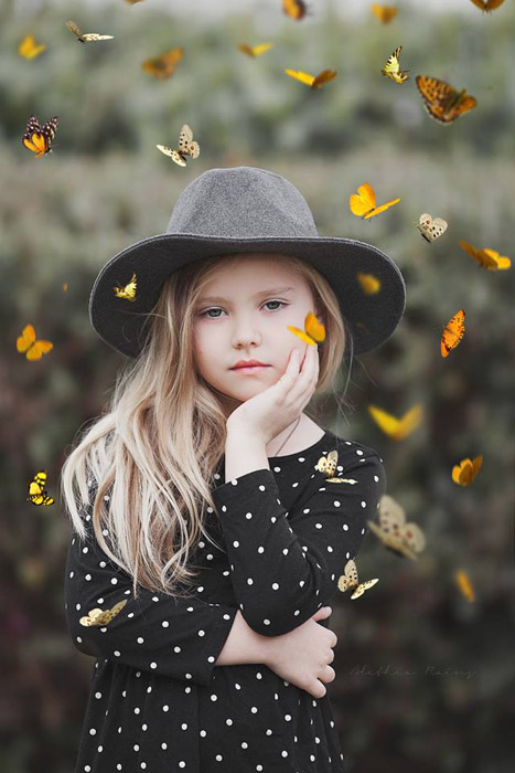
This image received high marks in mood and composition. Most of the judges felt that the concept for the shot was a good idea. The photo is well put together and tack sharp. Nice work!
Feedback is that the expression of the model doesn’t work with the mood of the shot. The excitement of the butterflies isn’t reading on her face. Might crop a little lower next time, too.
Alexander Lefler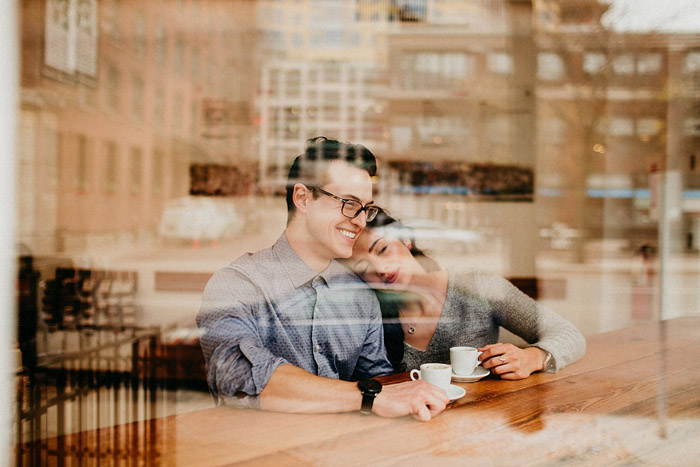
This image was highly praised for having a solid concept and technique. Effectively shooting reflections isn’t easy, but you pulled it off well. Very nice photo. The reflection gives the shot a voyeuristic feel, which complements the intimate connection the couple shares.
Be extra careful of anything that covers someones face in any way. Breaking up the face makes it difficult to connect with their emotion. The reflection was done well, but the composition could be better with a crop. Right now, they are smack in the middle of the shot. Also, the couple have different expressions which is a little confusing to the viewer.
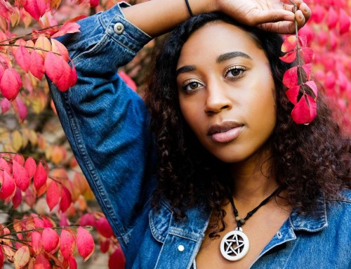
Carol Griffith-Roberts
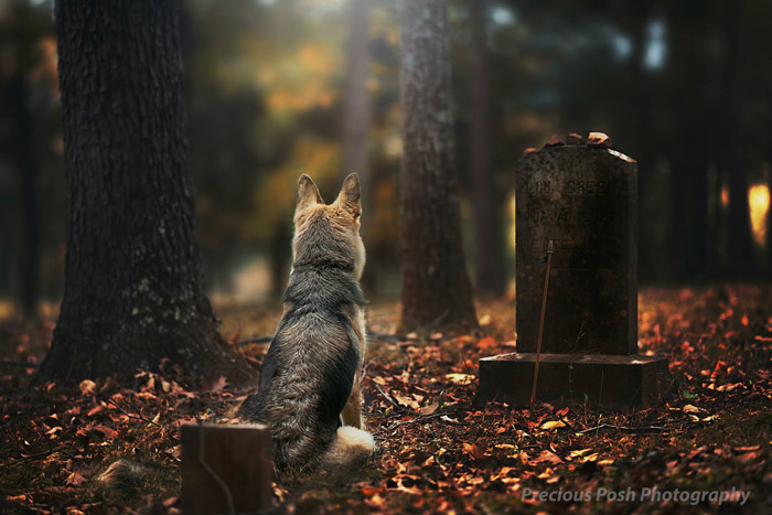
This was one of the highest rated shots in terms of mood from the bunch. There’s no need for a title as it does a great job expressing a story. The location is amazing. Dark, gloomy forest with a few small graves. Great stuff!
The shot could use some cropping to strengthen the composition. Hold your hand up over the tree on the left, and the image feels like it draws you in that much more. The dogs tail is unseen because of the headstone in the foreground. Dogs have tails, so it’s best to include it in the shot. The treatment is a bit heavy-handed, may want to step that back a bit.
You had another shot that made the top ten, but this one was more highly rated by the judging panel.
Crystal Collins-Isenberg
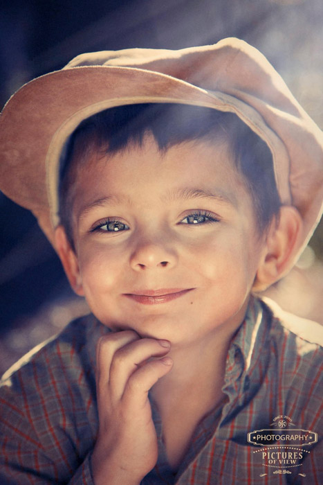
This shot was highly praised overall. The whimsical, curious nature of little boys is perfectly captured. The hand under the chin is well placed. It’s natural, authentic and the expression is believable. Well done.
It’s cropped too tight. And the uplighting is too strong for the shot. The lens flare is a bit too strong and it isn’t really adding anything to the shot.
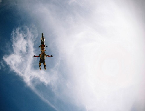
Leigh Crassweller Eros
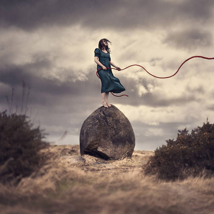
This shot received a lot of praise. It’s beautiful and surreal. The wind gives a lot of emotion to the image. Good use of color to strengthen visual components within the shot.
The rope travels outside of the frame very quickly. It’s a neat component, but what purpose does it serve? The bright color emphasizes the rope, but why? The front foot placement is a little uncomfortable. Being a symmetrical composition, the image is lighter on the right than the left making it feel unbalanced.
Matt Hendriks
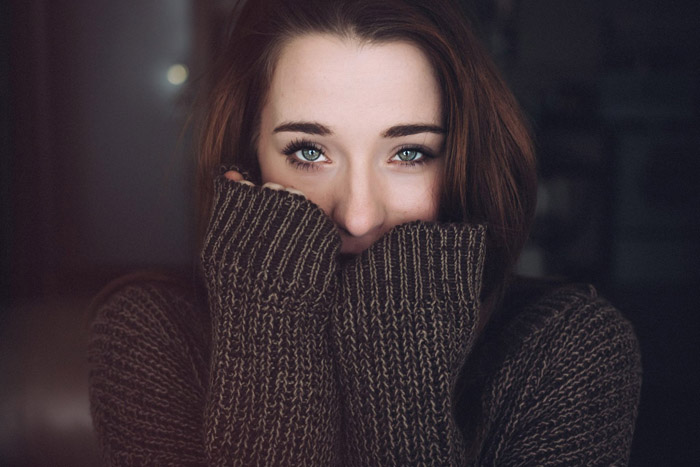
This shot was highly rated across the board. It’s sharp, beautifully lit, has great balance, and you did a stellar job with the subtle color grading.
The white highlight in the background is distracting, so I would do something to it. The skin is super clean, pours and wrinkles are completely gone. This makes it harder to connect with the model. Also, you could probably take the entire background down another 1/2 stop.
Morgan Aine Brackett
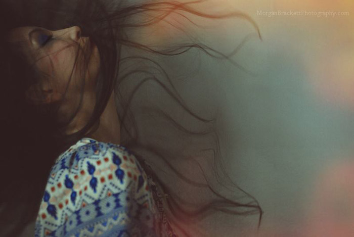 The concept and mood of this shot were it’s crowing achievements. It’s a terrific photo. Great posing, great hair, and great movement.
Beware of heavy light leaks. This image would benefit from bringing that down quite a bit. The wardrobe is a little distracting. The contrasty pattern on the shoulder grabs the eye. It looks a wee bit out of focus, and dark. Could use up to a full stop of exposure.
Roy Nuesca
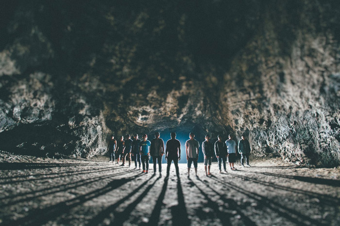
The mood of this shot is second to none. Great job capturing it. Nice play with the shadows, too. The cave location is amazing as well. Excellent work!
The composition is a little off. The left flank has more silhouettes than the right. Because the image is so close to being symmetrical, make sure everything else emphasizes that. Might want to bring the shadows on the faces up a little bit. They’re hard to see. The person in the center has no features, which feels strange.
Simon Cross
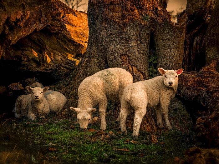
The judges gave this image high marks for composition. Overall, it’s a very solid photo. Great work. It has a nice sunset glow works well. The expressions melt any animal-lover’s heart.
Crop is a little off. The faces of the sheep take the eye’s attention. Shift it left to even it up. It’s also very tight, next time, crop wider and give the photo some breathing room. Right now, it’s a little claustrophobic. Either play up or completely remove the number 19. The color toning is nice, but its too strong.
Christina Ramsey
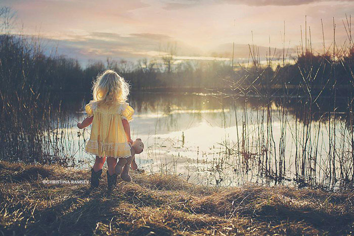
This shot was highly praised for its composition. It’s technically well put-together. Everyone likes the lighting in the shot quite a bit. The color grading was done well without feeling trendy. Great work. The little bear is a wonderful touch.
The saturation is all over the place in the shot. Most of it looks desaturated, but the girl looks over saturated. The highlights on the grass in the foreground are very bright. Burning them down a bit would help emphasize the girl. The sun flare is pretty sharp, too.
You had other shots that made the top ten, but this one was more highly rated by the judging panel. Let’s also give Christina a round of applause–her photo was the runner up.
*** Winning Photo – April Milani ***
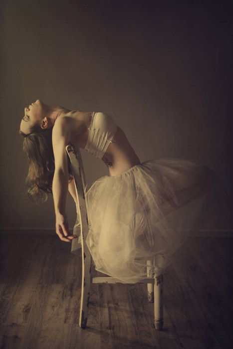
The mood of this photo is very, very appealing. The soft, directional light works extremely well with the pose. The color grading that you added complements the shot well. Be very proud of this one–it’s a great shot. It’s simple and elegant. Dynamic movement as well.
Judges feedback mention that the shot is cropped uncomfortably tight. Turning the chair as to show all of the legs would help add a bit more interest. It would also help the mostly hidden rear arm. Having her feet tucked under adds tension, but shortens the subject and hides one of her legs. Be careful with lens distortion and foreshadowing. The front hand appears very large which suggests masculinity. Also, it’s a touch on the dark side, try raising the highlights a bit.
Try Exposure Today

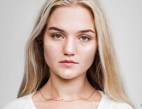
Congratulations April!! You’re awesome! & in the company of other terrific artists!!
Linda E
I came here expecting to see some great photographs (sponsored post on Facebook led me here) and I was not disappointed in the quality of the images. I was surprised at the level and quality of the feedback and critique by the judges. Each photo, while very good in their own right, had room for improvement. Kudos to the team for pointing out these area in a respectful and insightful manner. And kudos to the Photographers in the Top 10. They are all very inspiring!
sorry Jimmy, the April Milani image? darkness is what draws us in. any image can have usual highlights
True, but underexposed isn’t a style. ;-)
I disagree, Jimmy! What’s the expression? “One photo out of focus is a mistake, ten photos out of focus are an experimentation, one hundred photos out of focus are a style.” Same goes with under/overexposing. ;)
Way to go April. Finest among many wonderful photos.
[…] the opportunity to catch up with our recent Photo of the Quarter award winner April Milani. It’s always fun to connect with the winners and get to know them a […]
Higgledy-piggledy is dead right for Indian hill-stations in general and Darjeeling in patarculir. I’ve just added some more photos, from the time the skies cleared (temporarily) and from yesterday’s Toy Train ride down to Kurseong (30 km, 3 hours) and back on the narrow-gauge steam-powered train: lots of fun!