
Fine art photographer, Melanie Myhre is well-known for creating ethereal images. She’s been featured on our blog before. If you missed out on the article, check it out here. In the article below, Melanie share’s her opinions about Snap Art 4 and offers some technical tips for creating painterly images with a classical feel.
The rest of this article comes from her. Thanks, Melanie!

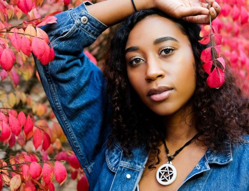
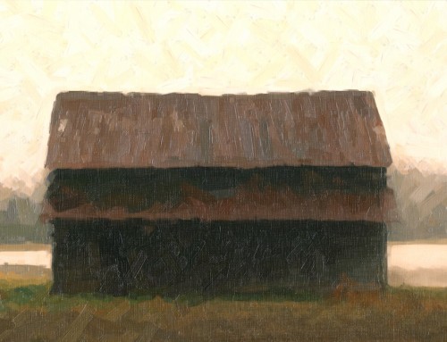
This is one of my earlier works, but it has always been a favorite of mine. This shot embodies the classical look I’m after. I color-toned in Photoshop and added some texture with Snap Art 4. I’m pleased with the way it turned out.
The background was black because she was facing into the setting sun. The Impasto preset on canvas looked best to my eyes. I masked details in her face to clarify her features. Popping the highlights made the effect appear like a classical painting.
I grew up in a highly artistic family. My mother is a painter, so naturally I learned to paint long before I picked up a camera. I started with crayons and wax pencils, then moved through other mediums such as pen and ink and acrylics. I spent long hours studying art history books, drooling over the works of the masters, hoping I could produce a fraction of what the greats created effortlessly.
In 9th grade, I discovered photography and everything changed. I’m still passionately inspired by the great painters throughout history. The Romanticist and Art Nouveau painters of the 18th and 19th centuries are particularly dear to my heart. John William Waterhouse celebrated feminine beauty with an ethereal, sacred grace. He portrayed women as goddesses, exemplifying attributes of the ‘English Rose’ such as soft feminine features and classical beauty. On the other hand, Alphonse Mucha celebrated the glitz and glamor of his era while still maintaining a goddess-like grace in the women he portrayed. Both artists emotionally evocative works used flowing hair, soft poses, and billowing fabric as prominent elements within the scene.

I just wanted to add a touch of painterly effect to emphasize the subject’s storybook features. In Exposure 5, I added a little blue to the shadows, making them appear milky, and I increased the highlights. Snap Art 4’s Impasto preset with the wood canvas texture looked best to me. All of the adjustments were minimal with one caveat–setting the photorealism slider as high as it goes. I used the detail masking feature to reserve the details of her face.

I chose to vignette this image and increase the warmth and saturation in Exposure 5 to add drama. In Snap Art 4, a thickened oil paint on canvas effect was enhanced further by adding directional strokes. I feel this increases the sense of movement in the image. I tightened the facial features by masking them and going to a very fine brush and increased photorealism.
I use much of the same approach in my photography work, even though it’s a different medium. I carefully arrange scenes in the natural outdoors–sometimes I’ll make my own props and wardrobe–and combined with creative posing, I can bring the shot together in camera. In my opinion, Photoshop composites just don’t have the same feel as the real thing.
I’ve experimented with various textures, color filters, packaged actions, and Photoshop techniques to give my shots a painterly look, but nothing satisfied the aesthetic I was after–until Snap Art 4. The realism of the effects rendered by this software is exactly what I’m after. They’re realistic enough to make people ask if it is a photo or a painting.

It is important to study the image(s) you have. Does it have a classical style, or is it more contemporary? This determines which elements of the image to emphasize and will help you to choose which effect in Snap Art will be the most believable. This image has a strong emotional element that I wanted to enhance. I chose a thicker Impasto preset and used a fine brush with lower photorealism. I increased the photorealism for the details with detail masking. This gave the image greater depth. I increased the highlights and shadows, the saturation of her hair, and I emphasized the creaminess of her skin with Exposure 5. As a final touch, I gave it a little warmth to add life. It started out as a cool-toned scene.

Watercolors are usually high in saturation, so I increased it in Snap Art 4. There was quite a bit of detail masking to keep the details of the face, hands, and toes legible. I adjusted the paint coverage to maximum to help maintain detail. The scene was backlit with the setting sun, so I increased the warmth a bit more and accentuated the sun flare in Exposure 5.
—
Check out more of Melanie’s work on her website, or become a Facebook fan to follow her workshop schedule and hear all of her latest updates.
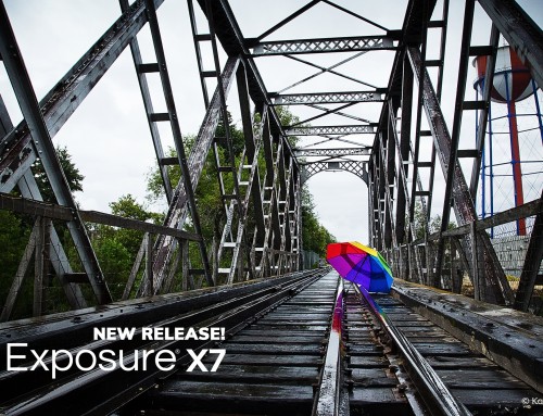
Try Exposure Today

Thanks for introducing us to Melanie’s stunning work. Much appreciated!
Can you advise how to get full coverage?
No matter what I try, there are ALWAYS tiny ares without coverage. Like you, I’m aiming for a look where people aren’t sure if it’s a photograph, but the speckles ruin it. I’ve tried altering their color, but it only makes it slightly less ugly; it does nothing to improve the realism. Nor does reducing opacity of the layer in Photoshop help (plu, I lose what I liked about the effect, as well).
Hi Rick,
There are a couple of ways to fill in the coverage. Some of the painterly effects cover better than others, though. Thicker paint looks such as Impasto or Oil will tend to cover a little better.
There’s also the lighting controls that will manipulate the highlights. This may be some of the cause of the speckles. These controls are demo-ed in the “Lighting For Textures” video, here’s a link: https://www.youtube.com/embed/WhsZAydy8ZU?rel=0