
Opinions about art and design are always subjective. There are plenty of people who see magic, where others don’t see anything at all. Any kind of photography critique is usually a great starting point for some juicy conversation, or fistfights, between creatives.
Our recent top 10 article displayed what the Facebook users group members think about the shots shared. We–Joe and I–also went through the shots together, argued a little bit, and then awarded last quarter’s winner. Check out da rules, if you have concerns or questions.
Since we are the judges, listen up if you want to win. Maybe you should mail us chocolates or protein powder. May help your odds a little bit. ;-) Just kidding–but seriously, protein.
In this photography critique, we take a deeper look at some of the shots. This is what the discussion is like when we sit and stare at the entries each month. Take it as a behind-the-scenes look into life as a marketing alien.
Any of the suggestions below are 100% creative comments. We are not picking on anyone, not busting anyone’s chops, and we’re certainly not saying that we’re the best out there. We are a couple of photographers who really love the medium, and we do our best to keep our eyes in analysis mode, as we do in this photography critique. Below are some comments about a few of the fave entries.
—

Jimmy:
Composition is good–it’s a little heavy on the left where the blob of dark leaves spills into the image. The blobs are bulky when compared to the couple–the subject–so it feels unbalanced. I’d crop the left of the image off a bit like the shot below.
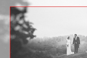
Where are the blacks in this shot? The groom must be wearing one of those hot, trendy grey suits. ;-) If he were darker, I think it would balance the shot more.
May want to reverse the polarity of the couple. Traditionally brides stand on the left of the altar–meaning they’re reversed, here. If the bride were higher, the couple would be looking at each other more level and their heads may be framed by the trees on the horizon.
Details–the little white thingy on the lower right is a little distracting. I’d nix that.
In the background, the values on the trees look posterized. This could be due to aggressive adjustments, or it could be just part of the shot. It reads a little bit like it was done by mistake, so I would make a tweak to tone it up or down a notch.
Joe:
I like this shot a lot and actually enjoy the negative space. The bushes and the horizon line act as a leading line and frame the couple well. I also like that the moment looks natural even though I’m guessing it was probably staged. Where the bride is standing is of no importance to me whatsoever, Jimmy. It’s also probably more flattering to the groom to appear taller than his missus.
The grey toning is fine by me, though it would probably not score well in a print competition. The matte look is pretty popular right now, though trends can actually make your image look pretty unhip pretty quickly. The sky does look a bit blown out, but it could just be one of those fab grey English summer days! I’m guessing the haze accounts for the posterised look of the trees Jimmy mentions too. I would probably look to make this B&W more snappy if it were my own image, but it isn’t so it’s fine as is!
I agree that white thing in the corner should probably come out, but I hadn’t really noticed it till Jimmy mentioned it!
Overall, a nice image.
—
Jimmy:
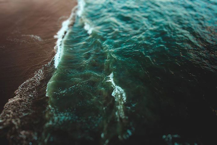
This shot is the shiznit! Love the colors. The juxtaposition of the aqua and brown is captivating to me. It reminds me of a Rothko painting. Pure and simple.
Composition works well. Golden spiral catches a lot of the attributes of the shot. The dark void on the left hugs the wide curve perfectly.
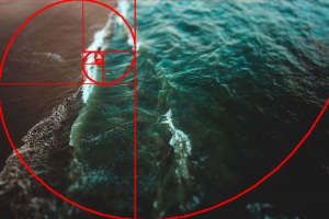
I would take the splash of orange/pink on the right of the chop out, if possible. Maybe a little desaturation would do the trick over there. I’m more of a purist, so I’d explore this as an option for finishing. Let the composition be weighted on the left with the brown color, but don’t put it in anywhere else. Maybe remove the little splashes on the lower right edge, too. Might read a little stronger.
This is the kind of shot I’d hang in my house. Nice work.
Joe:
—
Jimmy:
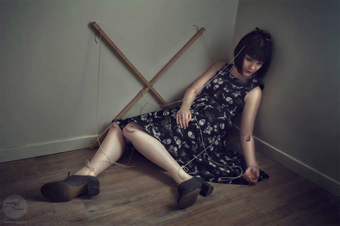
Really good composition, here. I drew in a few of leading lines on the shot to illustrate what I like about it. See how the triangle forces the eye around and back through the shot? The coloring supports the phenomena as well. The dark hair, dress, and shoes make a triangle of their own. Good stuff.
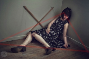
I would like to see the points of the triangle happen within the frame of the shot, the vignette helps a bit to indicate the position, but it’s not quite strong enough to anchor it, for me. Needs a little strengthening, or maybe a wider crop.
Joe:
This is an image I admire rather than like, but I think that’s kind of what the photographer wanted. I want to connect with the subject, but I can’t given that she’s a puppet and she isn’t looking at me. This leads to an intriguing sense of isolation that I kind of dig and feel uncomfortable with at the same time. So this image is a success for me – it makes me feel.
Obviously, the work to make the subject look so much like a real puppet must have been quite painstaking; it’s brilliantly done. I think the burning in around the cross and the head and arms is maybe a little unnatural looking and could perhaps be dialled back a bit – there seems to be a bit of a haloing effect going on there. Maybe that was intended though?
Again, a very strong image indeed.
—
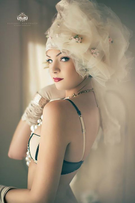
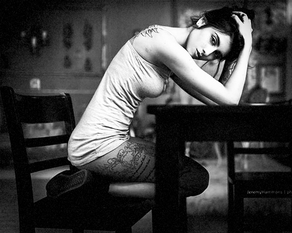
Jimmy:
This is a really cool shot–but the model could be wearing a trashcan and it would be pretty. Let’s be honest. ;-)
I’ve always been told that cropping the hands off at the wrist is traditionally considered a no-no. The elbow at the edge of the frame isn’t a big deal for me, though–I’ve heard mentions of that being a blunder before. Did want to make a small point about the front arm. It looks like it’s pressed against her body, which can make it appear wider than it is. This model is super skinny, so she can get away with it, but it shapes the arm more like a sausage instead of giving her deltoid shape. I vote that you put some air in there next time.
The rear hand is a little weird where it crosses the chin, but it’s not a big deal because of the glove. If it were the same tone of skin, I would imagine that it would blend together with the chin. Not super thrilled about the elbow behind her. It’s a little bit boob-shaped. I would have liked to see more of her necklace, too. Maybe it could have been integrated in with the rear arm? The highlight on the bracelet is a little bright, so it competes with her eyes. Might want to tone that down a touch.
Joe:
Jimmy – you are a fool. This is an awesome photo. The model looks fantastic and I love her pose. The amputated hand is fine by me and the elbow looks great too.
The only things I would point out, if you really pushed me to find a potential area of improvement somewhere, and since I have to balance praise with criticism in this photography critique, are the highlight right behind the subject’s face and the smoothness of the skin. For me, the highlight is a distraction and I would maybe burn that down a bit. The viewer’s eye is naturally drawn to the brightest part of an image so it competes with the model’s face a tad too much for me. Nikki’s style of retouching the skin is very flattering indeed to the subject, but I would dial that back a tad if it were me as it looks almost too perfect. Maybe that’s the Canadian air though? :)
Again, a lovely photo, which we have come to expect from Nikki.
—
 Jimmy:
Love the pose. It’s sexy, but not trashy. The supporting arm creates a triangle, and her under-turned legs strengthen and return the energy. Very nice. I think we could get away with a little cropping on the right. Her head isn’t quite center. Adjusting the crop would bring her eyes into line at one of the thirds, which would help balance out the shot. The table feels a little long, too.
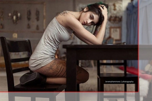
Bright spots! There’s a highlight on something in the background near her stomach and another on the left–the gold colored switchplate. I’d dial them down a touch, but that’s about all I’d do.
Joe:
Try Exposure Today

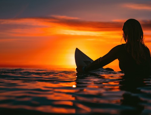

As much as I enjoy using exposure, I sometimes scratch my head at what you consider a good shot. The turquoise water and brown sand shot is nothing but a snapshot with some bokeh. I’ve been suggesting showing before and after photos to demonstrate exactly what it is in Exposure that enhances the photo, so we can see the magic of the transformation. Just my observations.Thanks, and keep up the good work!
Ha-ha! Thanks for sharing. I think it’s pretty, personally. The colors and the composition speak much more loudly than the subject to me. I’m drawn to that aspect of the shot myself.
You’re welcome to reach out to the users in our FB groups. Most of them are more than happy to share how they’ve edited their shots.
dont agree with you barry…i think it s a nice shot…good composition and edition. And if someone succeed to make a piece of sand and water interesting to watch… it clearly more than a snapshot ;)
Jimmy and David, thanks, and Barry I think you are right in that there isn’t really anything particularly special about this shot. I go to the pier with my family and see that there is a lot of character in the water and sand near sunset. I take a crap load of pictures and crop them to what I feel is interesting and don’t give a rats a$$ about any rules or composition, alien skin allows me to use some great tools to give it even more interest. I spent some time before I even brought it into exposure to even out the sand and give the water that deep tone. Besides that though I feel most images fall into Ansel Adams’ quote, “there are no rules for good photographs, just good photographs.” Not saying whether or not it is definitively good, I am often as surprised by what some people enjoy and others don’t. Keep shooting what you like and shoot lots of it and show the world. Thanks for your input too.
[…] Joseph Payne and I documented one of our internal debates in an article about some of the shots shared in the FB groups. Okay, it was really more of a cat […]
[…] you haven’t read through Joe and my internal debate article about some of the FB faves, you owe it to yourself to check it out. The last competition is […]
[…] out our Alien debate article where Joe and I chat about some of the shots shared online. Since the last competition is […]